Showing posts with label Felicity Jane. Show all posts

September 12, 2017

Personalized Color | Felicity Jane Heidi Kit


I love the fall feel of this month's Felicity Jane kit, Heidi. The first thing that caught my eye was those beautiful colors in the solid cardstock sheets. I knew that I wanted to highlight them and put them to good use! Since I was thinking about color, the idea to create little paint chips came to mind. What better way to showcase color than to create a custom, pretty palette of fall hues.


I created white boxes that are 1.5" wide by 1.35" tall, placing custom titles in the lower half. This personalized the story and embellishment. Using a very plain bolded Arial font for the title at the top is key in creating a nice clean look just like the Pantone color chips. I repeated the date at the bottom to keep the chips uniform. Gathering all the bits of color and spacing them to create a background layer for the focal photo to lay on was the key in this design.


To place some weight just behind the photo, I used a tag and envelope to ground the title and add a bold pop of blue to the layout. The script yellow title is held in place by the aqua strip die cut and the pretty yellow flower. To add a bit of design flair, I added a tassel attached with embroidery floss to the tag. This gives this area a pop of movement and something fun!


A sprinkle of circle die cuts (a contrasting shape), hexagon wood veneer and some left over puffy triangles completes the design. That scattering gives the boxy background so much needed movement. Contrasting shape is an easy way to achieve that.


Custom paint chips can be used in so many ways. Think of the possibilities for birthday, Christmas and baby layout. When you are looking for a clever way to put the kit solids to work - create a color chip!

August 13, 2017

Making a List Design + Felicity Jane


Hey there Felicity fans, Nancy here today with a look at the new Zoey kit. When my kit first arrived, the first thing that caught my attention were those big, beautiful numbers! I love every single thing about them - the patterns, colors, font and especially the size. I knew that I would center a layout design and story around them.


What better way to use numbers than to make a list? I am definitely a list making girl. I have daily, monthly and yearly lists for just about everything in my life. On this design, I focused in on an older photo of my niece. It's an every day shot without a specific story that I haven't scrapped yet. I decided that I would make a list to describe her at this age. A top 5 if you will. This is a great way to tell a story through journaling that is short and sweet.
 
Next, let's take a look at the design. I started with a white cardstock base at the bottom so that the beautiful patterns on the numbers could shine through. I scattered the numbers so that they looked like they were falling down the page. Tucking some of the numbers at the edge of the patterned paper lends to the tumbling effect. I used a 2" circle of vellum under one of the numbers to add shape and movement to the area.

​Just around the photo is a sprinkle of embellishments that leads the eye right to the subject - the girl! Layering different shapes is  key when creating a cluster like this. The heart, followed by a flag, topped with a sequin circle - staggered shapes work well together. Notice the half circle of vellum peeking through under the pink patterned paper? There are three of them scattered through the layout to give it some bounce (literally).
The title is clean and graphic, underlined with a simple line of stamped text. I like to combine dimensional alphas with stamping to create eclectic titles. I think it makes them more interesting. The journaling was printed on one of the 3x4 cards from the kit and stamped in aqua with "The Little Things". 


​Thanks for stopping by today and taking a closer look at the Zoey kit.  Don't forget the next time you have a favorite photo, make a list! A top 5 about your dog, vacation, hobby, home or day - the possibilities are endless. Use up your numbers and tell a story!


July 25, 2017

All About the Words + Felicity Jane

I love a good story. The words are one of my favorite parts of scrapbooking. I know that journaling can be tough for lots of crafters. It's so easy to get lost in the beauty of making, sewing and painting on layouts. I admit, I have pages that are totally art and light on words. Neither approach is 'right or wrong', they each tell their story in a different way. I like having a mix of both types of pages in my scrapbooks. Let's see what kind of story we can tell with the Kate kit this month.
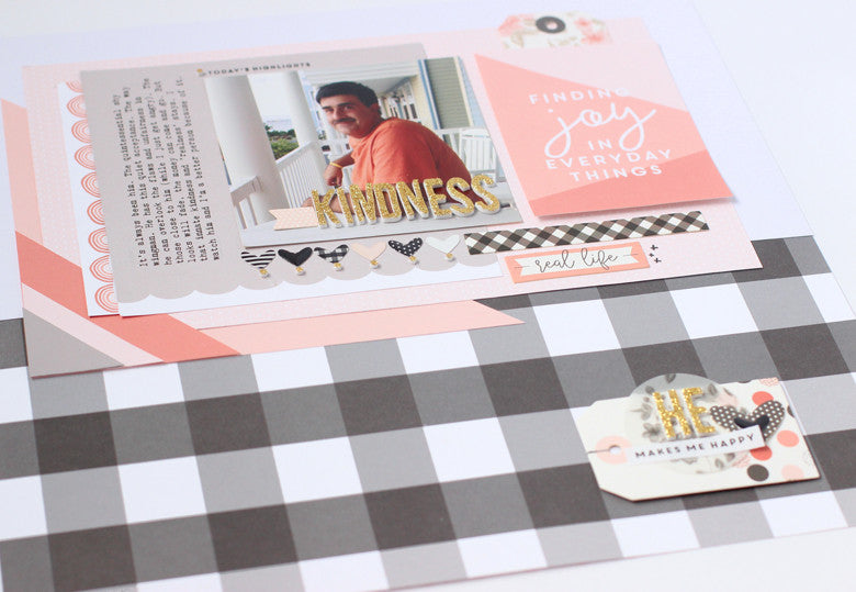
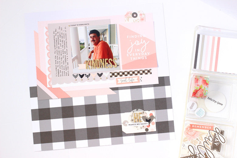
Kindness by @nancydamiano | @felicityjaneI focused this one on a favorite photo of my husband. When I looked at it, the first thing that came to mind was "kindness". That was the springboard for all of the words. Meaningful journaling doesn't have to be lengthy or complicated. Speak from the heart and those are the words worth recording.
Kindness by @nancydamiano | @felicityjaneNow that we have the words figured out, let's take a look at the design. I started with the bold black and white check pattern. I thought it would be a great contrast to all of the pale colors in this palette. I'm not afraid to make boy (or men) centered pages with feminine touches. I focus more on the feel or vibe that I'm trying to convey, rather than automatically match masculine colors. 
Creating layers around the focal photo is something I do frequently. Once I layed down the patterns and placed the title right in the photo, I lined up a row of hearts to underline the photo. They needed a little extra something and that was fulfilled with the 'dots' from the letter i's and exclamation points from the gold alpha. It's a simple touch that gives the design a special touch.
Kindness by @nancydamiano | @felicityjane
To balance out the heaviness of the top of the layout, a simple embellishment was created in the lower right hand corner. Layering a tag with a vellum circle, some stickers and an enamel heart is a great way to create a custom subtitle to a design.
Kindness by @nancydamiano | @felicityjaneCombining good, solid design and a meaningful story is a beautiful way to remember someone special. I love that Kate has beautiful intricate embellishments and patterns that are perfect for any story - even for the men in your life!
June 20, 2017

Stamping + Traveler's Notebook

It's that time of the year when we travel far (and near) from home to experience all of the best of summer. I was so happy to see a traveler's notebook in this month's kit - perfect for our recent trip to Florida! I decided to focus most of the design in these pages around the stamps included in the Summer Stamp Set. Let's take a look at how stamping + traveler's notebooks are perfect together.
Florida Traveler's Notebook by @nancydamiano | @felicityjane
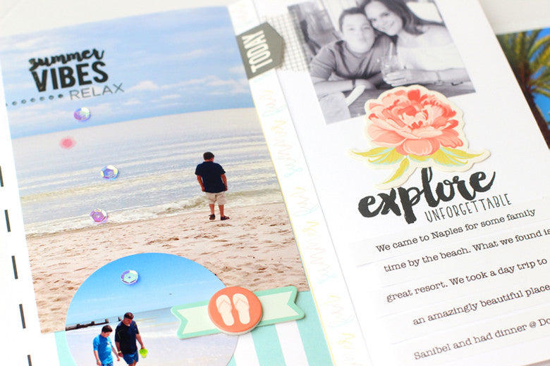
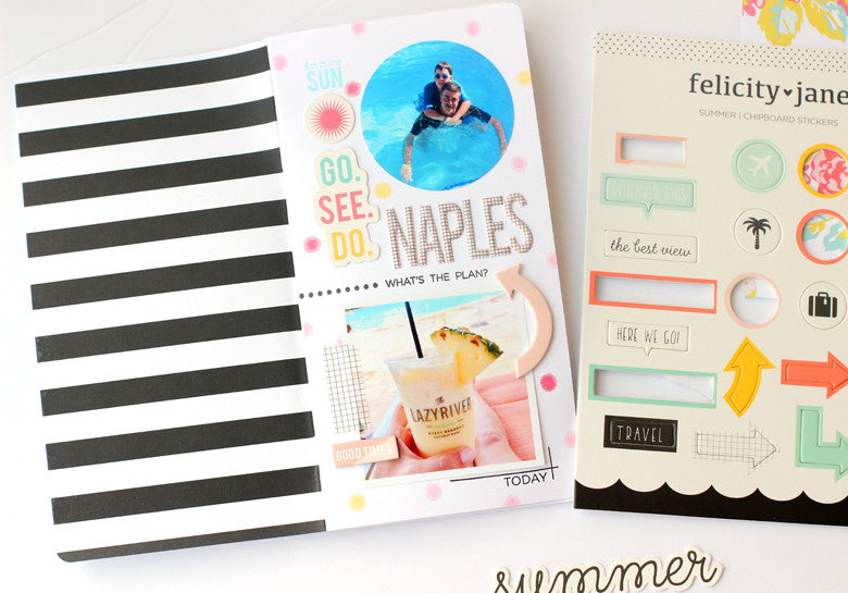
This is the opening page to my notebook. Don't you love that nice, bold black and white stripe on the inside cover? I started this page by using the small starburst in the Summer stamp set to create a fun background. Scattering stamped dots is a great way to add color to your notebook without the bulk of patterned paper. 
Florida Traveler's Notebook by @nancydamiano | @felicityjane
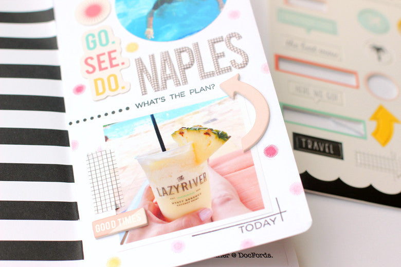
I separated the top and bottom halves of the page by using the dotted line  and "what's the plan" stamps. This simple line creates a border between the two photos.
This page contains also cleverly contains the "where" of my trip. If you take a close look at the photo of my drink, you can see the name of the resort. To highlight a main photo like this one, use the corner lines stamp and a sentiment from the Summer Stamp set to frame it out.
Stamped Traveler's Notebook by @nancydamiano | @felicityjane
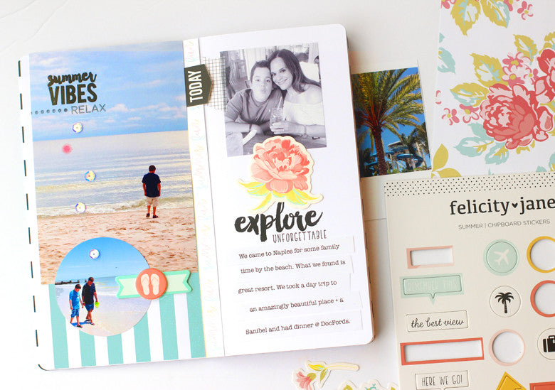
Adding a stamped title right in your photo is a great way to not only highlight the subject, but also cuts down on the bulk of sticker alphabets. Remember to use a permanent ink like Versafine when stamping on photo paper.  The same idea was used on the right side with the center, stamped title. The "explore" stamp looks like faux script writing here.
Stamped Notebook by @nancydamiano | @felicityjane

Thanks so much for stopping by today. I hope you've gotten some tips on how to use stamps in your notebooks. Happy travels!

June 7, 2017

Color Flow + Felicity Jane Summer

When I opened the Summer Kit, the first paper that caught my eye was this beauty. The perfect shades of a summer sunset with a kick. It reminded me so much of the scenery during a trip to Discovery Florida Orlando, that I decided to use it to tell the story of this amazing spot.
Discovery Cove by @nancydamiano | @felicityjane
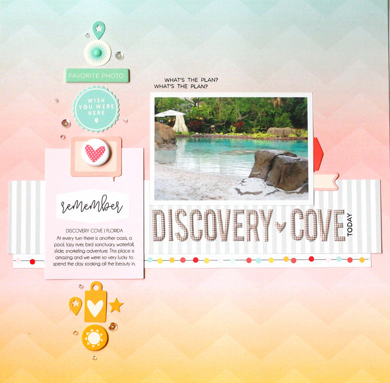
This pattern is so beautiful, I had a hard time covering it up! I wanted the design to flow naturally with the colors in the background. I started by gathering chipboard, die cuts and a journaling cards in the same colors of the paper.
Discovery Cove by @nancydamiano | @felicityjane
I lined up the colored embellishments to match the shades in a vertical line. This really emphasizes the transition of color while the embellishments add a variety of shapes and texture to the page. A well-designed paper like this can serve as a guideline while adding your own twist! 
Discovery Cove by @nancydamiano | @felicityjaneWhen creating a transitional, vertical line of embellishments like this remember to use many different shapes and sizes. The more the better the design will flow. Notice that a sprinkle of tiny sequins (from my stash) lead the eye from the top to the bottom - almost like a sparkly bread trail.
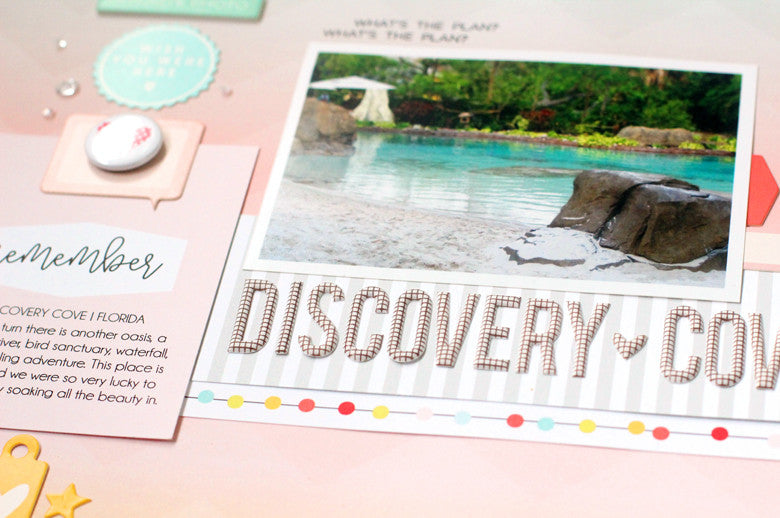
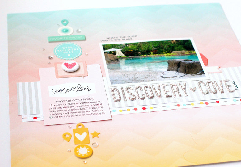
Discovery Cove by @nancydamiano | @felicityjane
The chipboard title is very long and serves as a shelf for the photo. The words underline the focal point and really draw attention to the center of the page. I placed a strip of neutral, gray striped patterned paper just underneath to ground the words. A border from one of the papers in the kit add a punch of color and some fun circles.
Discovery Cove by @nancydamiano | @felicityjane
Summer colors and photos are my absolute favorite to scrapbook. This beautiful kit is the perfect compliment to all of my summer stories. Don't forget to use color flow when you want to create beautiful layouts with a bold design.

May 3, 2017

Vertical Design Tutorial | Design School

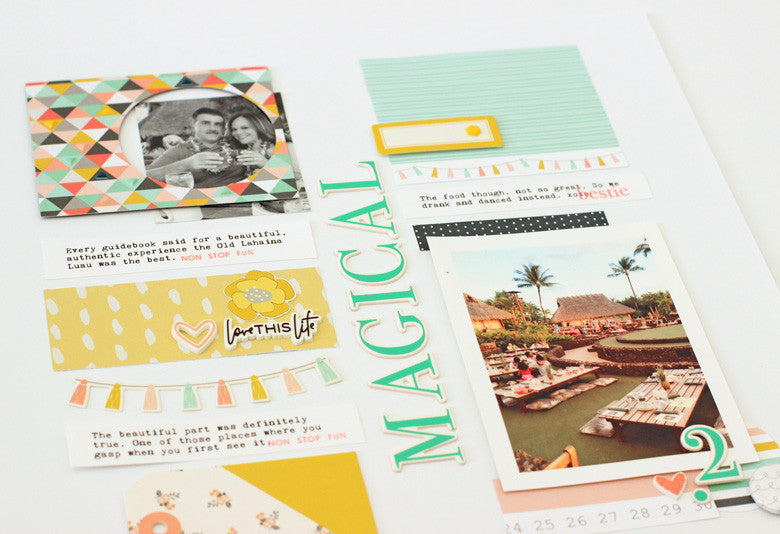
Let's talk about vertical designs - the ones that area clean and angular with lots of space for decorating and telling stories. I chose this type of design because I'm in love with this alphabet from the Caroline kit. The font, the color, the size - it's absolute perfection. What better way to show it off than to bring it center stage!
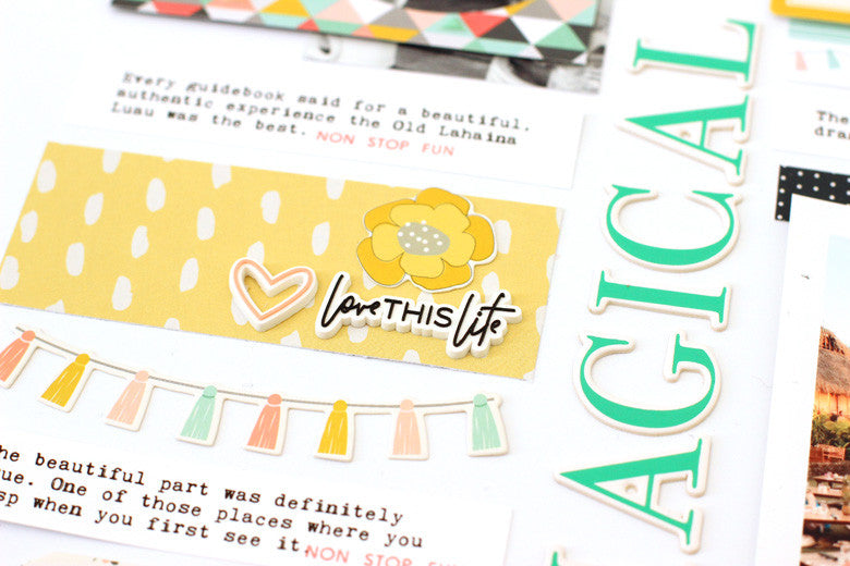
Magical Luau by @nancydamiano | @felicityjane
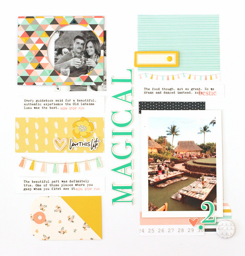
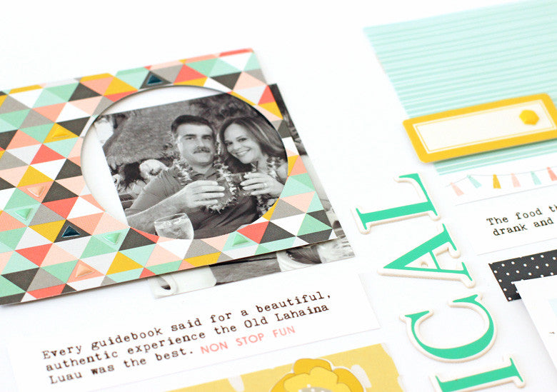
 Begin by dividing the page straight down the middle with a bold title. Then start working in vertical lines to the left and right sides of that midpoint. Make sure that your photos and patterns are evenly distributed. You don't want too much weight on one side - it makes for lopsided designs! For example, if you place a photo at the lower right, balance it with another photo on the upper left like above.
Magical Luau by @nancydamiano | @felicityjane
Mix up the widths and shapes of the stacked items in your vertical rows. This keeps the design from looking static (i.e. boring). Here is a rectangular strip of yellow patterned paper with a banner just underneath. This makes for an interesting design.
Magical Luau by @nancydamiano | @felicityjane
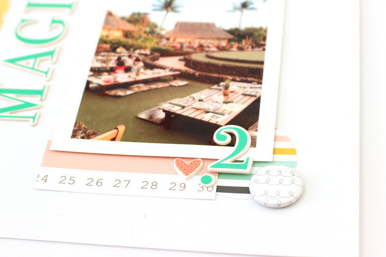
These designs tend to be a bit busy so make sure that you highlight the photo since that's where we want the focus to remain. Using strips of pattern paper to block the top and bottom of this vertical photo, along with layers of flair, circle-shaped patterned paper, chipboard and a heart rubber charm allow this photo to shine.
Magical Luau by @nancydamiano | @felicityjane

Repetition of shape (and contrasting ones) is really important when creating vertical layouts. Here, the two circles at the bottom right (in the flair and patterned paper shape) and mimicked in this frame. This creates symmetry as well. I love how it highlights this smaller photo as well.
Magical Luau by @nancydamiano | @felicityjane
 Vertical designs are a fun graphic look to experiment with. The Caroline kit with it's beautiful colors and embellishments is the perfect fit for this type of design!

April 19, 2017

Creative Backgrounds + Felicity Jane

Hello pretty little kit. That's what I think every month when I open the striped black and white box of Felicity Jane goodness. These are some beautifully designed kits and I look forward to getting them every month.
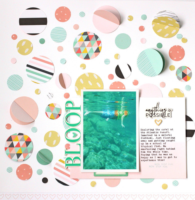
Today's challenge was to make a creative background and somehow combine it with this photo of my son snorkeling in the Bahamas. I pushed it around for a while when I thought "bubbles" - and that's where the idea for the circle background started. 
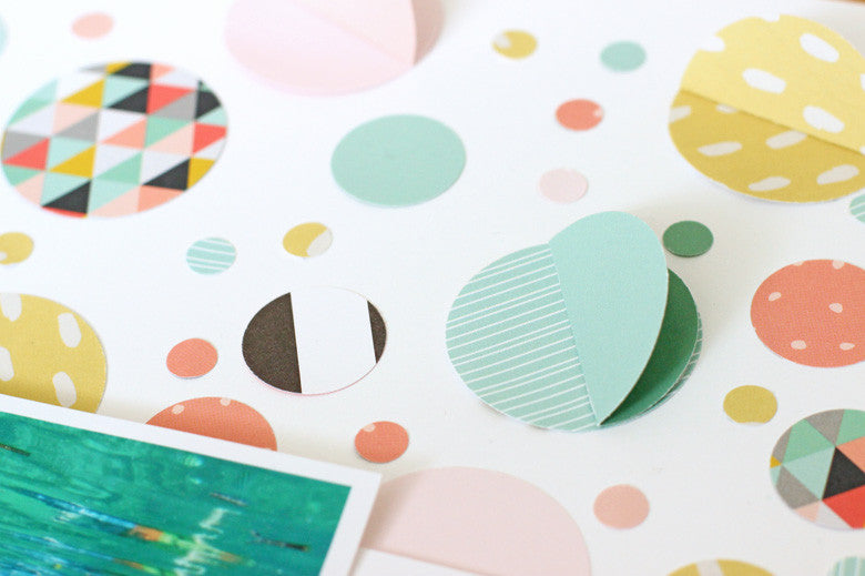
Bloop by @nancydamiano | @felicityjaneI used an electronic die cutting machine to cut out circles in 1-3/4", 3/4" and 1/4" sizes. I think I used just about every single patterned in the Caroline kit. I love it that much! By scattering them through the design, there is plenty of color and movement - perfect for my underwater story.
Bloop by @nancydamiano | @felicityjane
To give the circles a little lift (and interest), I cut out an extra circle. Next I folded it in half and adhere just one side to an existing circle on the layout. Fluff a bit, and you have a floating 3-D bubble. I love how the shape and texture ties in to my snorkeling theme.
Bloop by @nancydamiano | @felicityjane
To ground the photo, I used a pink and white patterned paper from the kit. I love how subtle this design is. Perfect for allowing my journaling to shine through. A rubber charm title and heart draw the eye to the words. I tucked the title "BLOOP" just under the photo vertically to really highlight the area. I want the eye to always go back to my photo, despite the beautiful background! 
Bloop by @nancydamiano | @felicityjane
Creating unique backgrounds is a fun way to get creative and tell a story. The Caroline kit is super versatile. I love that I was able to add my own theme and background. Bloop!

April 12, 2017

Tiny Banner Love + Felicity Jane Caroline Kit

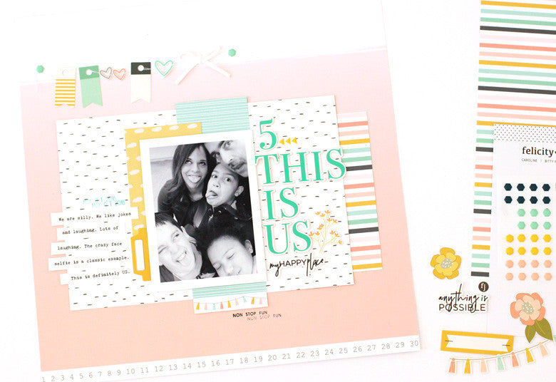
I've been working with some beautiful things lately. First up, let's take a look at the  in the new Felicity Jane May Caroline kit today. I love this color scheme. Actually, I've loved just about all of the FJ color schemes. They are soft, pretty and feminine, but not so overly feminine that I can't use them for my everyday layouts (including the boys).

This is Us by @nancydamiano | @felicityjane

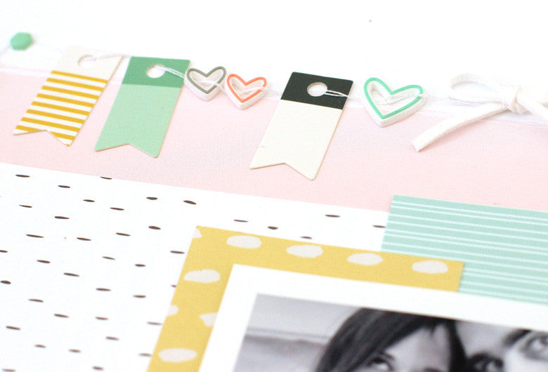
I tried my hand at a banner that was a little 'different'. Banners were a trend that blew up a few years ago. I challenged myself to do take another spin on them. 
This is Us by @nancydamiano | @felicityjane
I try to think of products 'outside of the box' that they were intended! For example, the rubber charm hearts in this month's kit. That opening in the center makes them perfect to string along my banner. The add that unexpected design element that makes layouts pop. To anchor the banner, use two puffy hexagon shapes with a punch of color. And to add a dainty something, you can't go wrong with a suede bow.
This is Us by @nancydamiano | @felicityjane
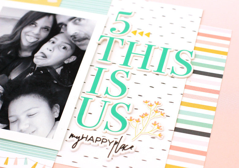
The title is a smash up of my favorite things in the Caroline kit. I started with that bold aqua alpha and worked from there. For contrast, the script silicone charm was perfect. And for pops of color, the yellow flower die cut and puffy arrows were perfect. The stacked title balances out the photo, paper layers and the banner.
Create banners with your favorite bits and pieces to decorate your stories!

March 27, 2017

Felicity Jane Kit | Watercolor Beginner

I've been playing with watercolors lately and it's been a challenge. A fun one, but I still struggle with the fluid imperfection of it. My very linear brain wants to control the flow of the water and it just ain't gonna happen. So this is a good exercise in non perfection for me. To keep this creative thing going, I need to challenge myself and step out of the box. So this is me stepping.


I used pink and orange watercolors from my Zig Kuretake set to create the background. I like that shade of orange that was created where the two colors mixed. I thought this was a good colorful background for the Jane girl illustration from the Felicity Jane March kit.  There's something so parisian and ooh-la-lat about her. I wanted a bold splash of color behind her.


You see that hard line of pink on the right side of the watercolor? That's a boo-boo. It happens when you use too much water and don't blot it right away. A hard line of color pools and you get that up there. I'm a rookie, so it happens. I left it though because even though technically it's a mistake I kind of like the way it looks.


I hand cut the roses from a Felicity Jane patterned paper to give her someplace to sit. A fancy little shelf. A stamped sentiment and some black wave washi complete the card.

I like cards because they're tiny canvases I can stretch my creative trials (and errors) on. They're a much smaller investment than a big 12x12 layout. And when I make mistakes like on this one, I roll with it and move on to the next canvas.

Thanks so much for stopping by. This week I'm focusing on painted butterflies, globes and some project life spreads I've made this month. Be back soon!

SUPPLIES Jane Kit Jane Stamp | Jane Washi Strips

February 20, 2017

Art Journal Mini Album + Felicity Jane

I've been on an artsy kick lately. Wilna's blog and her beautiful art journaling is inspiring me right now. The more I read, the more I've wanted to get messy with some acrylic paint and modeling paste.  I just needed a way to merge that art with scrapbooking. Take a look at what I came up with:

Felicity Jane Art Journaling Mini Album by Nancy Damiano


Say hello to the art journaling - mini scrapbook album hybrid. Merging stories from our recent trip to Hawaii, favorite photos and my foray into mixed media was the goal. I created small canvases (3-1/2"x3-1/2") for my first attempt at art journaling. I figured keeping it small would be helpful for a beginner. I used watercolor paper and gesso to prep the pages and then went at it with acrylic paint.

Felicity Jane Art Journaling Mini Album by Nancy Damiano


The beautiful London Felicity Jane kit was the answer that I needed to combine it all together. The colors for the art journaling squares came directly from the color palette of the kit. I love to draw inspiration from products and kits for color palettes. And this one worked beautifully for these pages. The London Stamp set was used throughout the pages to add text and a floral design to the project.
Felicity Jane Art Journaling Mini Album by Nancy Damiano

As a long time scrapbooker, it's so nice to stretch creatively with a project like this. I'm a neat freak by nature so the messy nature of art journaling is something that I had to get over. I'm glad that I took the leap and tried something new, because I really love the end result. It was messy, but that's what water and soap are for.

Felicity Jane Art Journaling Mini Album by Nancy Damiano


I ended up with a meaningful little book filled with favorite photos and art from my heart! There's stamping, art journal squares, pockets of confetti goodness and chipboard inside.

Felicity Jane Art Journaling Mini Album by Nancy Damiano


Take a closer look at Felicity Jane kits. They are often my best source of inspiration. These are beautiful, cohesive kits and you won't be disappointed.

Felicity Jane Art Journaling Mini Album by Nancy Damiano

SUPPLIES: Felicity Jane London Kit | London chipboard alpha | London Stamp Set | London Chipboard Shapes | London Paper Add On

January 17, 2017

Disney + Felicity Jane

The minute I opened the new Felicity Jane Sophie kit, my first thought was 'candy'!  This color palette of pink, yellow, aqua and a dash of navy is one of my favorites. It reminded me so much of all the Disneyland pictures that I had waiting to be scrapbooked.


Nancy Damiano Disneyland Scrapbooking


I chose this favorite photo of the castle and sketched out an idea that would really highlight the magical theme. The floating stars were inspired by the puffy stars in the kit. I needed a place to ground them and using large stitched stars was just that spot. 


Nancy Damiano Felicity Jane Disneyland Scrapbooking


The pretty stars is where the idea started. By making one larger star and using the kit stamp to personalize it, a custom embellishment was created. It lends weight to the upper left hand corner of the layout, balancing all of the elements.


Nancy Damiano Felicity Jane Disneyland Scrapbooking


The rubber charm "sweet" adds a nice dash of pink color to all the white in the center. It's also as a grounding spot for my story. To create a layered title that pops, I like to combine a script font with a bold one.  


Nancy Damiano Felicity Jane Disneyland Scrapbooking


The Sophie kit is chock full of beautiful embellishments, a sweet color palette and an entire sheet of 12x12 cut aparts. Everything that you need to tell your beautiful little stories! 

November 16, 2016

Process Video: Blended Ink Techniques + Felicity Jane


The minute I spotted the solid "now what?" stamp in the Emeline kit, I thought polka dots! And so that's exactly what I did. A beautiful burst of rainbow hues on a stark white background.

Take a look a the video to see how the blended ink technique is achieved. It's a lot simpler than it looks.


Creating custom backgrounds is a great way to use stamps. The colors and pattern possibilities are endless!


Supplies Used:  Emeline Kit  |  White Puffy Alphabet  |  Emeline Stamp Set