
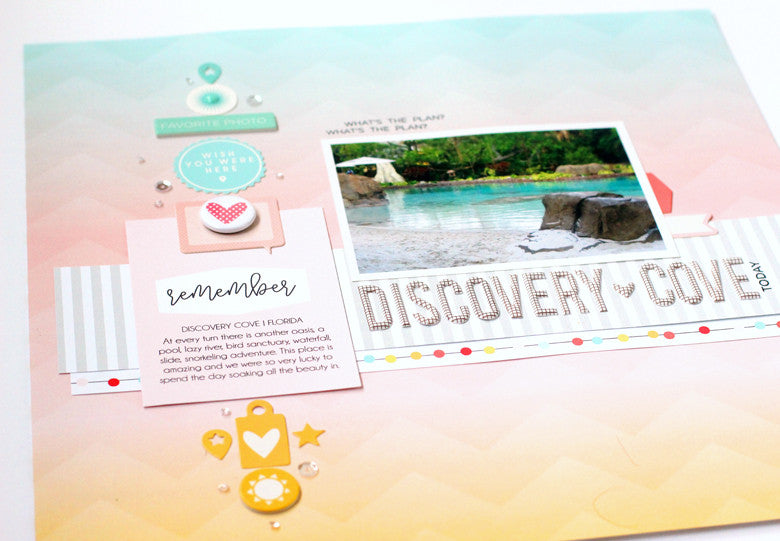
When I opened the Summer Kit, the first paper that caught my eye was this beauty. The perfect shades of a summer sunset with a kick. It reminded me so much of the scenery during a trip to Discovery Florida Orlando, that I decided to use it to tell the story of this amazing spot.
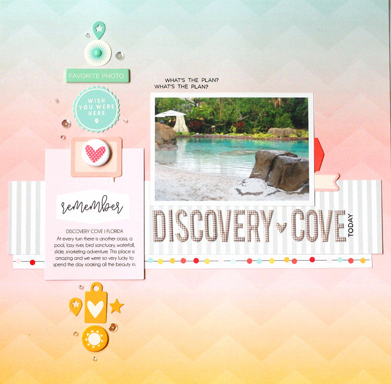
This pattern is so beautiful, I had a hard time covering it up! I wanted the design to flow naturally with the colors in the background. I started by gathering chipboard, die cuts and a journaling cards in the same colors of the paper.

I lined up the colored embellishments to match the shades in a vertical line. This really emphasizes the transition of color while the embellishments add a variety of shapes and texture to the page. A well-designed paper like this can serve as a guideline while adding your own twist!
 When creating a transitional, vertical line of embellishments like this remember to use many different shapes and sizes. The more the better the design will flow. Notice that a sprinkle of tiny sequins (from my stash) lead the eye from the top to the bottom - almost like a sparkly bread trail.
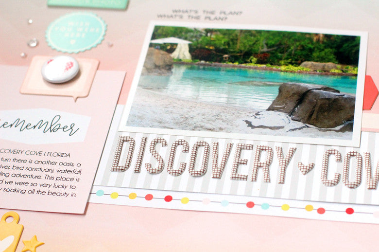
The chipboard title is very long and serves as a shelf for the photo. The words underline the focal point and really draw attention to the center of the page. I placed a strip of neutral, gray striped patterned paper just underneath to ground the words. A border from one of the papers in the kit add a punch of color and some fun circles.
Summer colors and photos are my absolute favorite to scrapbook. This beautiful kit is the perfect compliment to all of my summer stories. Don't forget to use color flow when you want to create beautiful layouts with a bold design.
SUPPLIES | Summer Kit | Summer Puffy Alphabet | Summer Chipboard | Summer Flair | Summer Journaling Cards | Summer Stamp


This comment has been removed by the author.
ReplyDelete