Showing posts with label Vacation. Show all posts

June 7, 2017

Color Flow + Felicity Jane Summer

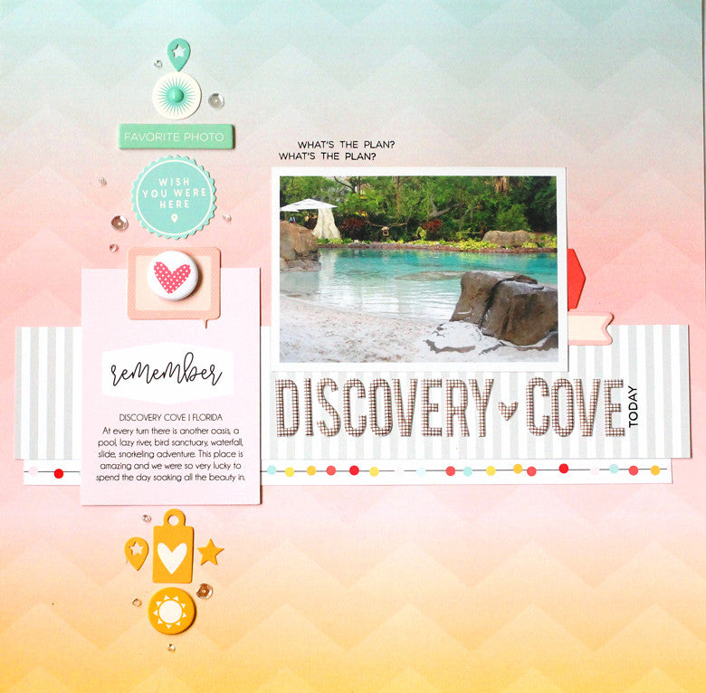
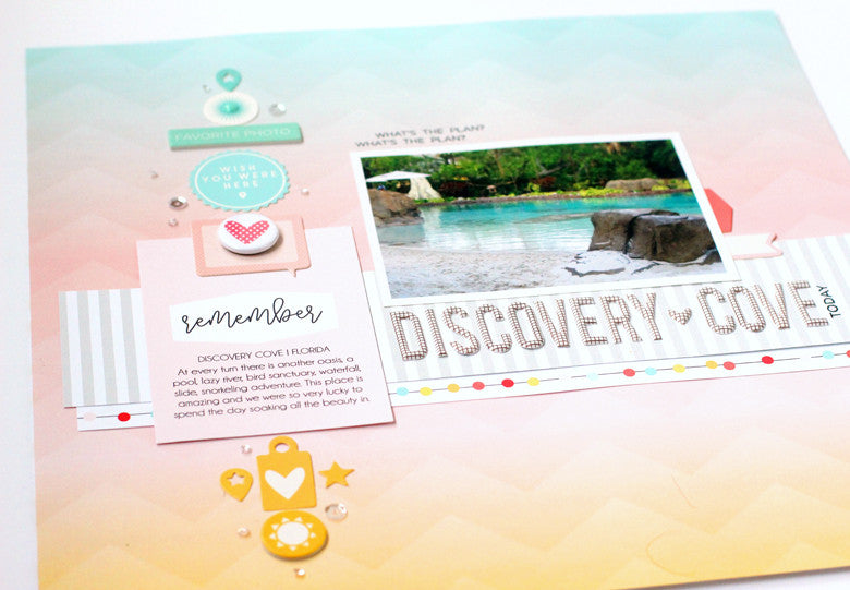
When I opened the Summer Kit, the first paper that caught my eye was this beauty. The perfect shades of a summer sunset with a kick. It reminded me so much of the scenery during a trip to Discovery Florida Orlando, that I decided to use it to tell the story of this amazing spot.
Discovery Cove by @nancydamiano | @felicityjane
This pattern is so beautiful, I had a hard time covering it up! I wanted the design to flow naturally with the colors in the background. I started by gathering chipboard, die cuts and a journaling cards in the same colors of the paper.
Discovery Cove by @nancydamiano | @felicityjane
I lined up the colored embellishments to match the shades in a vertical line. This really emphasizes the transition of color while the embellishments add a variety of shapes and texture to the page. A well-designed paper like this can serve as a guideline while adding your own twist! 
Discovery Cove by @nancydamiano | @felicityjaneWhen creating a transitional, vertical line of embellishments like this remember to use many different shapes and sizes. The more the better the design will flow. Notice that a sprinkle of tiny sequins (from my stash) lead the eye from the top to the bottom - almost like a sparkly bread trail.
Discovery Cove by @nancydamiano | @felicityjane
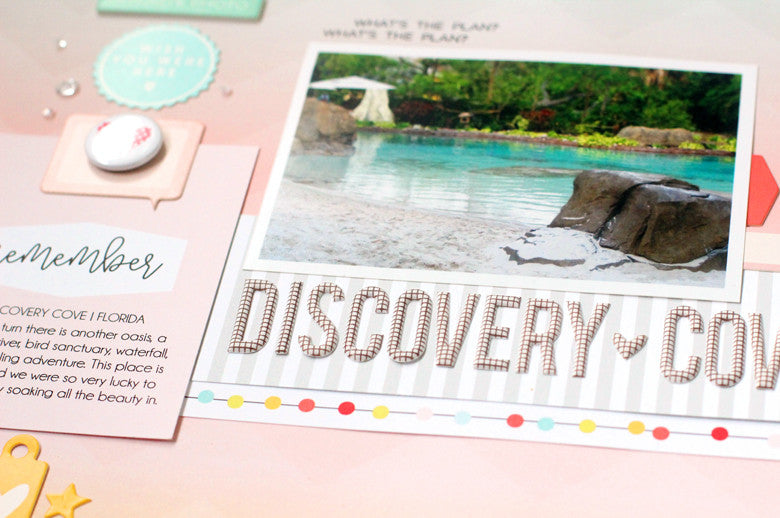
The chipboard title is very long and serves as a shelf for the photo. The words underline the focal point and really draw attention to the center of the page. I placed a strip of neutral, gray striped patterned paper just underneath to ground the words. A border from one of the papers in the kit add a punch of color and some fun circles.
Discovery Cove by @nancydamiano | @felicityjane
Summer colors and photos are my absolute favorite to scrapbook. This beautiful kit is the perfect compliment to all of my summer stories. Don't forget to use color flow when you want to create beautiful layouts with a bold design.

May 11, 2017

Elle's Studio May Kit + Project Life


The kit this month at Elle's Studio is all about color, bright summery colors that I love! I probably say that every month about Elle but it's true. This kit designer is all about beautiful palettes and that's what draws me to them.


I had what I call a collection of odds and ends photos from our trip to Universal last spring. Just snapshots that I loved that didn't make it into scrapbook layouts and detail shots that I knew would be perfect for my project life spreads. They are a peek into our vacation and little moments I don't want to forget. Especially, that big pink delicious doughnut!


I love this bright yellow Nope card. It reminds me so much of the Minions in the photo with my son. A handful of sequins make it a great shaker accent.

I've been using the May Elle's Studio kit to create a few more project life spreads. I'll be back to share soon!

KIT USED | click on the photo for more info


May 2017 Kit

July 6, 2016

Amy Tangerine + Handstitching

Stitching is a design element that I keep going back to again and again. There's nothing like a little needle and thread work to add a pop of color and texture to a story.

I made this a while back for the American Crafts blog using Amy Tangerine's Finder's Keepers collection. I wanted to highlight this story about swimming with the dolphins in Atlantis, keeping the design bold but not so bold that it would eat the photo!
To see how I created the title, see the blog post here. Basically, I cut the center out of the AC DIY Subway Alpha Stickers, stuck them down to the layout and then filled in the missing parts with embroidery floss. Instant pop and that handmade touch I like to add!
This one took a bit of planning. I had to decide the spacing for the title, mark off exactly where the journaling would go and then run the background through my Epson wide format printer
To add weight to the photo, layers of die cut Finder Keepers paper were used. A few wood and transparency embellishments and a few tickets tucked just underneath add more color and weight to the focal point. The bold diagonal background does the same thing - draws the eye right to that photo smack in the center!


SUPPLIES (affiliate links):


July 3, 2016

American Crafts | Dear Lizzy Happy Place

Versatility - it's what I love about a good scrapbook collection. Good colors, a variety of icons that are just the right amount "themey" and a few good embellishments is what I found in Dear Lizzy's Happy Place Collection. Here are few things I've made with it lately.
Layered cards for the season. The suede mini tassels are one of my favorite embellishments this season. And I've never met a gold paperclip flamingo I didn't love.

Proof of how much I love texture and color. I wanted to create texture with a tropical feel. Rows and rows of pretty little squares frame out the photo and scream "Caribbean."


Glitter dipped die cuts are a quick and easy way to give a card some pop factor. I cut the star with my Silhouette and popped it up with foam for dimension.


Who doesn't love a glittery wand and envelopes full of confetti? These were created for my niece's birthday party and they were a hit!


Lining up rows of the watercolored die cut titles from the collection are an easy way to create a bold layout. Layers of the pretty papers and die cuts add to the tropical feel of the photo and story.


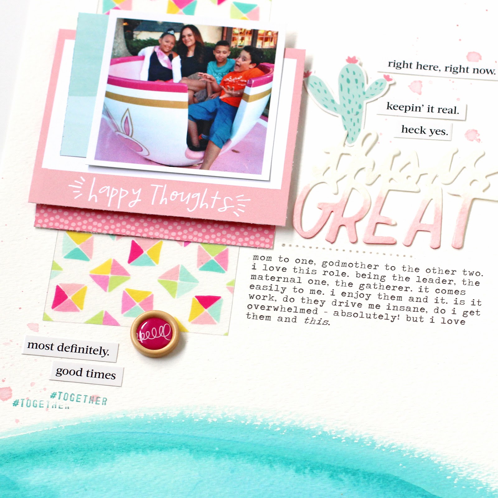
A departure from all the vacation layouts, here I used the Happy Collection to make an everyday page about the little people in my life and being a Mom. Using the same watercolored word die cut pack, I customized this one with a light pink color wash. I love that the pack of die cut words comes both pre-printed and plain on watercolor paper so that I can use it in a variety of ways!

SUPPLIES:


May 6, 2016

Design Your Story - American Crafts Dear Lizzy Happy Place


Collection | American Crafts Happy Place

The Story | This one is about my son and his love of the clear, blue Caribbean. It's the first thing I thought of when I first looked at this picture. The clarity and color of that water and that big goofy grin. I also thought about telling the story of those two missing teeth, but I'll get to that one later. That very first thought is usually what I build the journaling around. Because I find that's the most authentic when telling a story. Always go with your first gut reaction to a photo. It's what you remember most and that's important!

Design |  I wanted to create something clean and layered to go with this bold photo. White is my go to background because photos and colors really pop on a clean background. 

I divided the design in two. Stacking all of the watercolored die cut words down the right side of the layout gives it a bold impact. I really wanted those words to stand out. To balance that out, on the opposite side are layers and layers of patterned paper and that beautiful acetate sheet. If you look at the design, there's an "invisible line" vertically down the page dividing the die cut words (on the right) and then everything else lined up along the left. This is an example of balance and repetition in design. And it's easy!

Supplies | Click on the photo links below for more information:


August 17, 2015

Process Video + Simple Stories

As summer starts to come to a close, I find myself looking through vacation photos and feeling nostalgic. Last year our entire family got together and rented a beach house in Ocean City, Maryland. 8 adults, 3 kids and 2 babies under two in one house. Can you say cray cray? This was my husband's idea of relaxation so I just drank coffee and went with it.
OC3


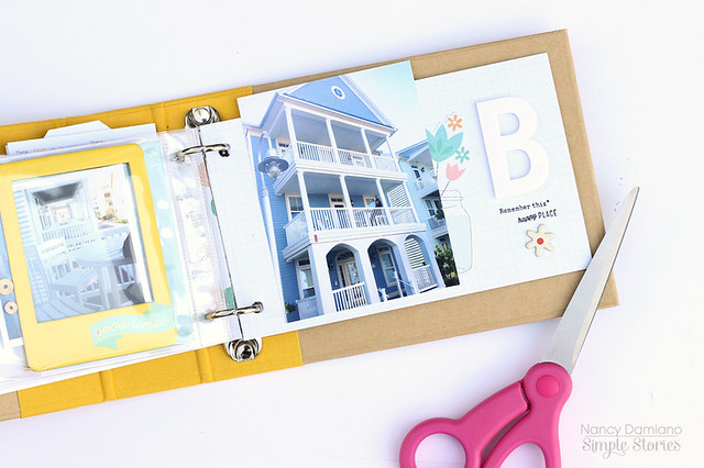
I used the 4x6 SN@P! binder album in a bright, sunny yellow. It's filled with page protectors in 3x4, 4x4, 4x6 (divided) sizes, blank ledger pages and chipboard yellow dividers. 

Take a look at the video to see how it all came together (and please subscribe to my YouTube channel for more inspiration!):


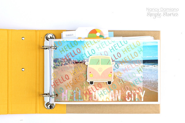
Here's a closeup of some of the details. I used a 4x6 transparence from the Summer Vibes Collection Pack to create a divider. 
OC1

These pages came together really quickly. I limited the supplies to chose from and went for a cleaner, but still layered look. The pops of color and fun icon in the line keep it from looking to plain.

Here's to celebrating summer, big family vacations,  and mini albums!

August 7, 2015

My Mind's Eye On Trend + Favorite Eats

Pattern8

COLLECTION | My Mind’s Eye On Trend
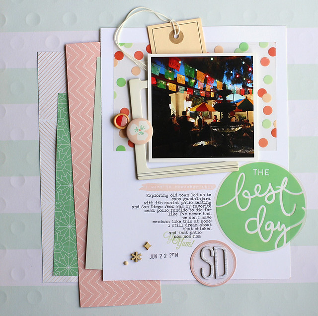
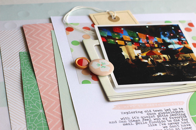
STORY BEHIND THE PAGE | I was going through my California trip photos when I came upon this imperfectly perfect shot. I had just enjoyed my favorite meal of the trip, Pollo Fundido at Casa Guadalajara in Old Town, San Diego. This dark photo brought me right back to that time and place. Sitting on the quaint patio with its twinkling lights, fountain and mariachi band playing in the background. Sometimes it those technically not great photos that capture the best, simple memories.
Pattern9
DESIGN |  The On Trend collection by My Mind’s Eye is all about generic stripes and dots with splashes of mint, pink and orange. I chose it because the pale colors set off the very dark photo. It has just the right amount of pop and festive (in the colors and polka dots) to set the stage.
I kept this design very simple with just two major areas of layering. The first is the background made up of vertical strips of patterned paper layered on a horizontal stripe background. Next, a bed of layers to make the photo pop were created with a polka dot transparency, chipboard frame and tag.

SUPPLIES | My Mind's Eye On Trend | Avery Elle Inks | Epson Wide-Formant Printer

July 20, 2015

Watercolors + Kits

HelloRain collection | Scraptastic Darlene Kit - April 2015

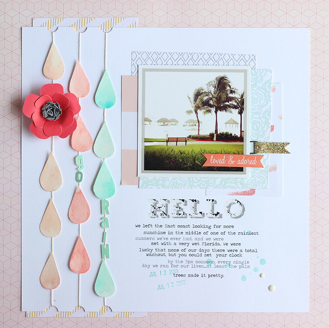
story | I used the Darlene Kit and Add-on to create this page about a vacation moment. It rained every single day while we were in Florida and I remember taking this picture during the daily monsoon. 

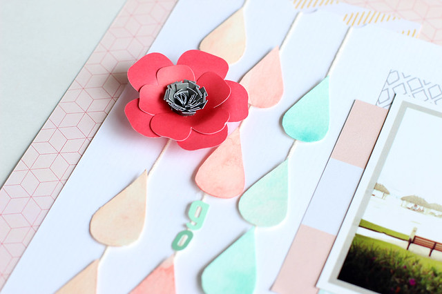
design | I hand-cut the raindrops and the used watercolors to add a nice soft look to the shapes. Using watercolor paper was really important because the shapes remained sturdy even after adding water and paint. After letting them dry for a free hours, I strung them to make rows of colorful rain. Adding a large flower and some text added a pop of color and texture to the strands. 

HelloRaindetail The Darlene kit has a beautiful range of colors in coral, mint and gold. Colors and a feel that I would probably never put together on my own. That's what I love about kits, they push me to stretch creatively!

April 16, 2015

Scrapbooking Kit Roundup

I have been such a bad, bad blogger. I like blogging, I really do - because I like to talk and it’s kind of like having a conversation with yourself. That doesn’t sound crazy at all.  I started instagramming earlier this year and that’s where I post almost every day. But I miss the time capsule that the blog creates,  so here I am again.

Where to start though? How about at the beginning – this is what I was up to in January:


When it’s cold and dreary and snowy, this is where you can find me. I miss the light and the living.  The only thing that keeps me from falling into a funk is making things. I spent so much time at my desk this winter. In January, I worked with the Scraptastic This Must be the Place kit to create these pages:


I love going back in time to when Nico was a baby and telling a story. I keep journals so the story is from 2005 although the making occurred in 2015. If I close my eyes, I can remember exactly what he smelled like at this age – heaven. That I miss, the sleep deprivation I wrote about, not so much.


Scrapbooking sunny days makes the dark days better right? I remember pulling this photo out and wanting to tell the story of California and all the shopping I did before our trip. A whole new wardrobe of dresses and accessories for my niece and her love of all things sparkly and aqua. I had a really hard time with this design. I wanted to highlight the softness of the ombre pink and floral papers and at the same time give it a bit of ‘edge’. I tried to do that with the triangle up in the left corner. I’m not sure if it really works though. It’s one of those pages I look at and go hmmm??


This photo just makes me laugh. Screaming, mouth wide open – yep, that’s me on a ride. I love that my husband captured this. Here I wanted to use the frame stamp and highlight bits of cardstock in shades of yellow and aqua. It doesn’t really tie into the screaming theme, I just wanted to try the technique. I took this apart several times, searching for the balance between not enough and too much. I wanted to highlight the stamping, but not at the cost of the photo. Keeping the title white on white and using a bold black and white print at the top, gives it an interesting yet minimal look. I loved the way this one turned out in the end (even if it took me days to work out).
  
The versatility is what I love most about the Scraptastic Kits. When I can take one box of supplies and create three very different pages (soft, feminine and graphic) – I know I have a winner.

November 24, 2014

Scraptastic November Kit + Maggie Holmes Open Book

My goal this month was to design two layouts that were radically different with the November Scraptastic kit. At first look, the Shake it Off kit has a very soft, feminine feel to it. I started at that jumping point and chose to highlight this photo of my niece at the Bippity Boppity Boutique in Disneyland. It was my favorite shot from our trip – the look on her face is just priceless!


The intricate design of the wood veneer complemented the ‘fancy’ feel of the photo. I painted it with a thin coat of watered-down, white acrylic paint so it wouldn’t steal the spotlight from the photo. It is that beautiful! I also thought it would be the perfect “o” to my “xo” title. The idea for that came from the rub-on on the side of the photo that reads: ‘I love everything about this’. I do and I wanted that sentiment to be front and center.
My challenge here was to go with a bold palette, use at least 3 photos and a tiny title. The complete opposite of the “XO” page. The kit has so many versatile patterns and colors that it was easier to do this than I had anticipated.
First, I picked out the heart patterned paper and two coordinating cardstock colors. Then I laid out the photos in a grid design adding a spot for journaling. Next, Iayered a small veneer title, die cut card and embellished tag for pops of color and dimension.


The finishing touch came at the end with the three layers of triangle photo corners in the lower left side. Stitching the edges, using two different patterns and stacking them gives this area of the layout weight and that something ‘special’ detail. On the opposite corner, I used the patterned heart paper to balance the design out.

November 5, 2014

Scraptastic Heart it Races Kit


This month I've been working with the Scraptastic Heart it Races Kit and Add-On. I chose this set to work with because I love all the bright colors and graphic feel. It can be used for so many different types of pages and that's what I tried to do this month - a mix of every day, vacation, girl centered and neutral layouts.


This file folder paper from Maggie Holmes latest collection is one of my favorites. I cut it up here and used it to balance out a enlarged photo from my son's birthday party. The story is about our tradition of gathering the balloons and doing a release at the end of all his parties. It's one of my favorite moments and I was lucky enough to have this picture of it.
This page was built around the colorful "paint swish" paper from Chickaniddy's Scrumptious collection. I thought it would make the perfect backdrop for some of our Disneyland photos. This one is the moment the kids first hit Main Street in all their silly glory.
The last layout was created around another favorite pattern - the stacked titles in this bright Studio Calico paper. It gave me a great girl palette to work with. The story here is about just that - the little girl in our lives and how even in the midst of boy centric Legoland, she finds the brightest pink girl spot.
Three very different pages all created with one kit. That's what I love about Scraptastic and how they put things together. The kits are packed and the palettes work with all types of photos. Makes my life easier for sure!