Showing posts with label Scraptastic. Show all posts

August 20, 2015

Process Video + Scraptastic Kit

Nancy Damiano // The Paper Orchard. Process Video

KIT | Scraptastic July Kit 

STORY |  I made this layout to document a seasonal tradition. At the start of every summer,  I make my  entire family ride the flying swings. Some go more willingly than others. I don’t have to force the kids, it’s the adults that give me lip.

FlyingSwingClip

Our first trip to the boardwalk and this ride mark the beginning of the season. This time I was able to capture that tradition with a flying  iPhone shot. Luckily I didn’t lose the phone and captured this great picture of my shoes over the boards. The colors in the photos + the candy colors in the kit went together like PB&J.

VIDEO | Take a look at the video to see how the design process came together:


I was able to highlight my favorite part of the kit – those big, colorful dots. Keeping the design on the clean and linear side compliments the photo + the ‘stuff’.  And that’s where I’m happiest creating.

August 5, 2015

Scraptastic Kit + Amy Tangerine

Every month as soon as I get my kit, I pick out my favorite things and make it a goal to use them. The first thing I set aside this was the sticker sheet from Amy Tangerine’s Rise and Shine collection. I am not so great with the watercolors so I'm glad that Amy is.

the stuff | scraptastic kit club May kit + Amy Tangerine Rise & Shine

BoysGirlstag

the story | The photo is one I took on vacation last year of my son, niece and nephew. When I wrote the journaling I was looking at the picture and thinking that they are so alike in some ways and yet so different. Is it a personality thing or gender? 

BoysGirlDet
Here’s a closeup of my favorite sticker. I used it almost like a photo corner in the bottom right of the design. It frames out the journaling and creates a diagonal line from the photo.


BoysGirlsDet2
Cutting up patterned papers and layering them with flair and frames from the kit  draw attention to the photo. It's a pretty bed of layers for the focal point. 

I like all of the elements in this kit. It's not a combination I would naturally gravitate towards and that's exactly why I like kits. They let me stretch creatively (in a good way).

July 20, 2015

Watercolors + Kits

HelloRain collection | Scraptastic Darlene Kit - April 2015

story | I used the Darlene Kit and Add-on to create this page about a vacation moment. It rained every single day while we were in Florida and I remember taking this picture during the daily monsoon. 

design | I hand-cut the raindrops and the used watercolors to add a nice soft look to the shapes. Using watercolor paper was really important because the shapes remained sturdy even after adding water and paint. After letting them dry for a free hours, I strung them to make rows of colorful rain. Adding a large flower and some text added a pop of color and texture to the strands. 

HelloRaindetail The Darlene kit has a beautiful range of colors in coral, mint and gold. Colors and a feel that I would probably never put together on my own. That's what I love about kits, they push me to stretch creatively!

April 16, 2015

Scrapbooking Kit Roundup

I have been such a bad, bad blogger. I like blogging, I really do - because I like to talk and it’s kind of like having a conversation with yourself. That doesn’t sound crazy at all.  I started instagramming earlier this year and that’s where I post almost every day. But I miss the time capsule that the blog creates,  so here I am again.

Where to start though? How about at the beginning – this is what I was up to in January:


When it’s cold and dreary and snowy, this is where you can find me. I miss the light and the living.  The only thing that keeps me from falling into a funk is making things. I spent so much time at my desk this winter. In January, I worked with the Scraptastic This Must be the Place kit to create these pages:


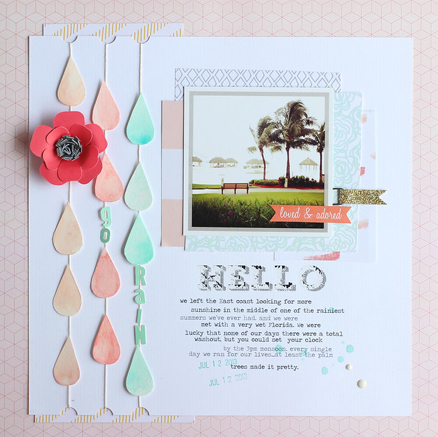
I love going back in time to when Nico was a baby and telling a story. I keep journals so the story is from 2005 although the making occurred in 2015. If I close my eyes, I can remember exactly what he smelled like at this age – heaven. That I miss, the sleep deprivation I wrote about, not so much.


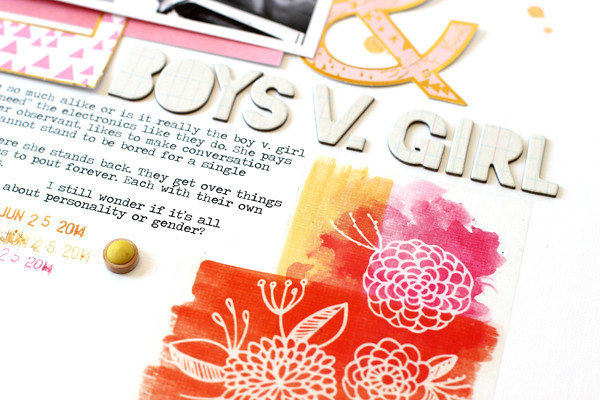
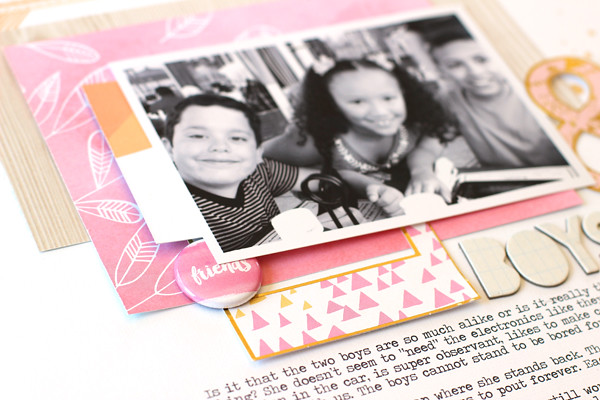
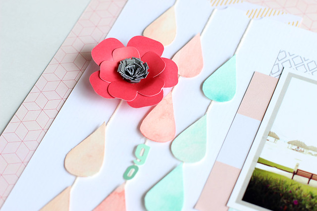
Scrapbooking sunny days makes the dark days better right? I remember pulling this photo out and wanting to tell the story of California and all the shopping I did before our trip. A whole new wardrobe of dresses and accessories for my niece and her love of all things sparkly and aqua. I had a really hard time with this design. I wanted to highlight the softness of the ombre pink and floral papers and at the same time give it a bit of ‘edge’. I tried to do that with the triangle up in the left corner. I’m not sure if it really works though. It’s one of those pages I look at and go hmmm??


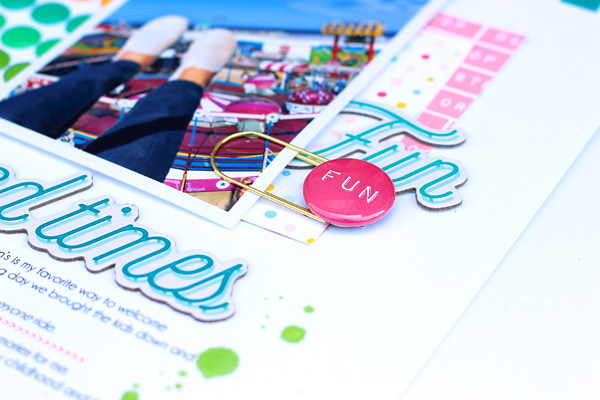
This photo just makes me laugh. Screaming, mouth wide open – yep, that’s me on a ride. I love that my husband captured this. Here I wanted to use the frame stamp and highlight bits of cardstock in shades of yellow and aqua. It doesn’t really tie into the screaming theme, I just wanted to try the technique. I took this apart several times, searching for the balance between not enough and too much. I wanted to highlight the stamping, but not at the cost of the photo. Keeping the title white on white and using a bold black and white print at the top, gives it an interesting yet minimal look. I loved the way this one turned out in the end (even if it took me days to work out).
  
The versatility is what I love most about the Scraptastic Kits. When I can take one box of supplies and create three very different pages (soft, feminine and graphic) – I know I have a winner.

March 25, 2015

Disneyland Carsland Opener


STORY | This will be the first page of my Disneyland album this year. It's the reason we went after all. The kids picked California because they wanted to visit Carsland. It's one of the handful of photos that we have of our group and is perfect for telling this story.

DESIGN | I kept this design pretty straightforward and simple. I started with the bold polka dot print to ground the large, bold photo. I placed the photo right where the pattern meets the white card stock. This is a major focal point and it's where your eye goes immediately! 

The target card in a pretty, contrasting teal color repeats the circle shape and balances out the photo. The large white star fades into the background and adds some shape and texture to the white area. The bold black and white word bubble stickers point right to the journaling - so the story doesn't get lost.

KIT | Counting Stars Kit by Scraptastic (February 2015)

November 24, 2014

Scraptastic November Kit + Maggie Holmes Open Book

My goal this month was to design two layouts that were radically different with the November Scraptastic kit. At first look, the Shake it Off kit has a very soft, feminine feel to it. I started at that jumping point and chose to highlight this photo of my niece at the Bippity Boppity Boutique in Disneyland. It was my favorite shot from our trip – the look on her face is just priceless!


The intricate design of the wood veneer complemented the ‘fancy’ feel of the photo. I painted it with a thin coat of watered-down, white acrylic paint so it wouldn’t steal the spotlight from the photo. It is that beautiful! I also thought it would be the perfect “o” to my “xo” title. The idea for that came from the rub-on on the side of the photo that reads: ‘I love everything about this’. I do and I wanted that sentiment to be front and center.
My challenge here was to go with a bold palette, use at least 3 photos and a tiny title. The complete opposite of the “XO” page. The kit has so many versatile patterns and colors that it was easier to do this than I had anticipated.
First, I picked out the heart patterned paper and two coordinating cardstock colors. Then I laid out the photos in a grid design adding a spot for journaling. Next, Iayered a small veneer title, die cut card and embellished tag for pops of color and dimension.


The finishing touch came at the end with the three layers of triangle photo corners in the lower left side. Stitching the edges, using two different patterns and stacking them gives this area of the layout weight and that something ‘special’ detail. On the opposite corner, I used the patterned heart paper to balance the design out.

November 5, 2014

Scraptastic Heart it Races Kit


This month I've been working with the Scraptastic Heart it Races Kit and Add-On. I chose this set to work with because I love all the bright colors and graphic feel. It can be used for so many different types of pages and that's what I tried to do this month - a mix of every day, vacation, girl centered and neutral layouts.


This file folder paper from Maggie Holmes latest collection is one of my favorites. I cut it up here and used it to balance out a enlarged photo from my son's birthday party. The story is about our tradition of gathering the balloons and doing a release at the end of all his parties. It's one of my favorite moments and I was lucky enough to have this picture of it.
This page was built around the colorful "paint swish" paper from Chickaniddy's Scrumptious collection. I thought it would make the perfect backdrop for some of our Disneyland photos. This one is the moment the kids first hit Main Street in all their silly glory.
The last layout was created around another favorite pattern - the stacked titles in this bright Studio Calico paper. It gave me a great girl palette to work with. The story here is about just that - the little girl in our lives and how even in the midst of boy centric Legoland, she finds the brightest pink girl spot.
Three very different pages all created with one kit. That's what I love about Scraptastic and how they put things together. The kits are packed and the palettes work with all types of photos. Makes my life easier for sure!


August 8, 2014

In the summertime....Simple Stories + Scraptastic

I've gotten so many ideas and pages from the Scraptastic's July Sail kit. I'm not sure if it's the cool nautical vibe or the fact that I'm desperately trying to hang on to what's left of summer. 

It seems like we just came back from California and I love looking back at these pictures. One of our favorite days was a very laid back afternoon on Mission Bay. The kids chose to rent a speedboat instead of going to the zoo. I think they were all theme parked out. 
I love everything about this sticker (the colors, the icons, the text) and I was determined to work it into the design. Adding a circle of handstitching and some random stickers, sequins and a date stamp give some lift to the flatness of it.
 Layers of patterned paper gave me a pop of turquoise and a shelf to put the title on. I used a little swipe of turquoise paint on the white wood background to soften the edges of the linear design.
This page speaks to me. It highlights pictures that make me smile, a good memory and pretty layers of paper. It doesn't get better than that for me!

July 26, 2014

Painted Backgrounds

This picture of Nico makes me laugh, it so him. Laid back + funny + waiting on the world to cater to him. That's my kid. The sole picture tells the story perfectly so it's all I needed. That left we with a lot of space to get creative. I started the canvas by brushing some acrylic paint on the white background to match the aqua in the photo.
 All of the things I used on this page came from Scraptastic's July Sail kit. While it has a definite nautical theme, it also includes a lot of pieces that can be used for telling any story.


 The circle die cut is the perfect place to add little bit and pieces. I love details - they're one of my favorite things to design.
I cut up strips of aqua paper and layered them under the photos and embellishments. This adds a layer of texture and shape to the base. I used Staz-On ink to stamp on the painted background.


The paint anchors everything on the layout. It made putting the rest of pieces together easy and highlights the photo. Layers of tags by Scraptastic and a journaling card from Carta Bella add just the right punch of bright color.

March 20, 2014

Scraptastic Kit Love


Back in February I was asked to be part of the design team over at Scraptastic Kit Club. It was good timing since I had been thinking about the premise of kit clubs and how much simpler it would be to create with one box of supplies instead of digging through every item I own to put something together.

In March, I chose the It's My Life kit and Add-On. I loved every single included in this kit and especially the colors. One of my favorite part of putting layouts together is playing with color. I created this quick grid layout by cutting up one of the patterned papers. It gave me a place to layer bits and pieces, journal and add photos.
Sewing the grid with aqua thread gives the white background a pop of color. Alternating flat and dimensional pieces adds texture to the layout.
Filing in blank spaces with stamped text adds a handmade touch to pre-printed papers. 
I think the best part of Scraptastic is that you can choose between two kits every month. That way you get to decided what works best for your style and photos. That combined with great customer service and the fact that you can quit at any time without a fee, make joining risk free.

Below are the sneaks for the April kits. On the left is Worth Remembering, and on the right is Let Me Go.

This month I chose the kit on the left, Worth Remembering which is surprising because I usually stay away from pink and flowery elements. But I have these great photos of my niece and I've wanted to include more of her stories in my scrapbooks. It's this type of flexibility to chose a kit, that makes Scraptastic top notch! To find out more about signing up for a monthly subscription you can go to their site here.