Showing posts with label Summer. Show all posts

June 20, 2017

Stamping + Traveler's Notebook

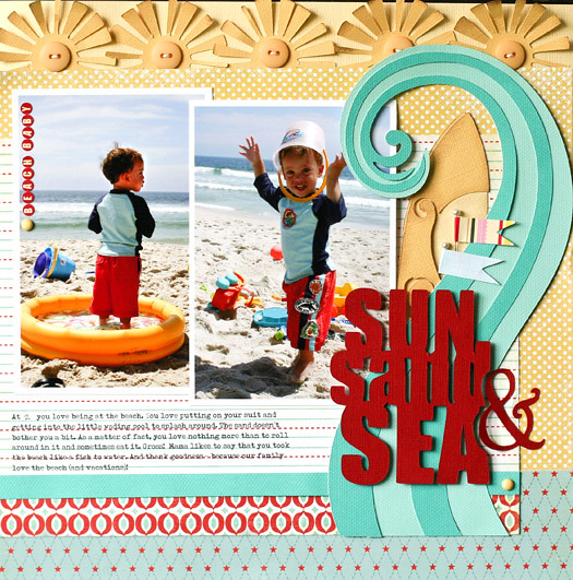
It's that time of the year when we travel far (and near) from home to experience all of the best of summer. I was so happy to see a traveler's notebook in this month's kit - perfect for our recent trip to Florida! I decided to focus most of the design in these pages around the stamps included in the Summer Stamp Set. Let's take a look at how stamping + traveler's notebooks are perfect together.
Florida Traveler's Notebook by @nancydamiano | @felicityjane
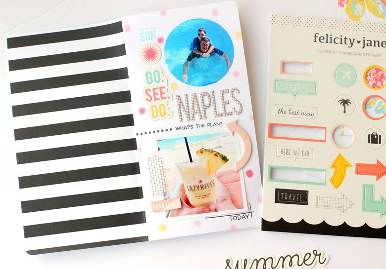
This is the opening page to my notebook. Don't you love that nice, bold black and white stripe on the inside cover? I started this page by using the small starburst in the Summer stamp set to create a fun background. Scattering stamped dots is a great way to add color to your notebook without the bulk of patterned paper. 
Florida Traveler's Notebook by @nancydamiano | @felicityjane
I separated the top and bottom halves of the page by using the dotted line  and "what's the plan" stamps. This simple line creates a border between the two photos.
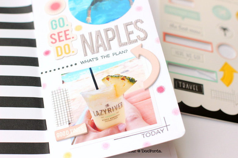
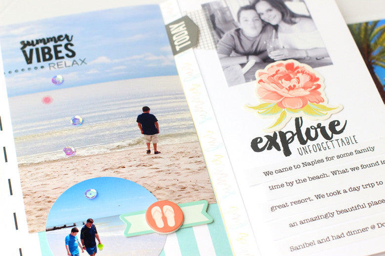
This page contains also cleverly contains the "where" of my trip. If you take a close look at the photo of my drink, you can see the name of the resort. To highlight a main photo like this one, use the corner lines stamp and a sentiment from the Summer Stamp set to frame it out.
Stamped Traveler's Notebook by @nancydamiano | @felicityjane
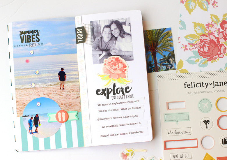
Adding a stamped title right in your photo is a great way to not only highlight the subject, but also cuts down on the bulk of sticker alphabets. Remember to use a permanent ink like Versafine when stamping on photo paper.  The same idea was used on the right side with the center, stamped title. The "explore" stamp looks like faux script writing here.
Stamped Notebook by @nancydamiano | @felicityjane

Thanks so much for stopping by today. I hope you've gotten some tips on how to use stamps in your notebooks. Happy travels!

August 8, 2014

In the summertime....Simple Stories + Scraptastic

I've gotten so many ideas and pages from the Scraptastic's July Sail kit. I'm not sure if it's the cool nautical vibe or the fact that I'm desperately trying to hang on to what's left of summer. 

It seems like we just came back from California and I love looking back at these pictures. One of our favorite days was a very laid back afternoon on Mission Bay. The kids chose to rent a speedboat instead of going to the zoo. I think they were all theme parked out. 
I love everything about this sticker (the colors, the icons, the text) and I was determined to work it into the design. Adding a circle of handstitching and some random stickers, sequins and a date stamp give some lift to the flatness of it.
 Layers of patterned paper gave me a pop of turquoise and a shelf to put the title on. I used a little swipe of turquoise paint on the white wood background to soften the edges of the linear design.
This page speaks to me. It highlights pictures that make me smile, a good memory and pretty layers of paper. It doesn't get better than that for me!

March 20, 2014

Scraptastic Kit Love


Back in February I was asked to be part of the design team over at Scraptastic Kit Club. It was good timing since I had been thinking about the premise of kit clubs and how much simpler it would be to create with one box of supplies instead of digging through every item I own to put something together.

In March, I chose the It's My Life kit and Add-On. I loved every single included in this kit and especially the colors. One of my favorite part of putting layouts together is playing with color. I created this quick grid layout by cutting up one of the patterned papers. It gave me a place to layer bits and pieces, journal and add photos.
Sewing the grid with aqua thread gives the white background a pop of color. Alternating flat and dimensional pieces adds texture to the layout.
Filing in blank spaces with stamped text adds a handmade touch to pre-printed papers. 
I think the best part of Scraptastic is that you can choose between two kits every month. That way you get to decided what works best for your style and photos. That combined with great customer service and the fact that you can quit at any time without a fee, make joining risk free.

Below are the sneaks for the April kits. On the left is Worth Remembering, and on the right is Let Me Go.

This month I chose the kit on the left, Worth Remembering which is surprising because I usually stay away from pink and flowery elements. But I have these great photos of my niece and I've wanted to include more of her stories in my scrapbooks. It's this type of flexibility to chose a kit, that makes Scraptastic top notch! To find out more about signing up for a monthly subscription you can go to their site here.

May 24, 2013

Jillibean Soup

My Dad and today's childrearing rules do not go hand in hand. The worst of them being bicycle helmets. He goes on and on about how as a kid the best feeling in the world for him was the freedom of speeding down the road on his bicycle - wind whipping through his hair. The more I try to explain that 'when you know better, you do better', the more he rolls his eyes at me. Sometimes I do wonder how I made it through my own childhood alive. We didn't have helmets or seat belts for that matter.

So on this day, Grandpa was breaking the rules. No helmet bike riding. Now don't judge me too harshly, I didn't stop it because they were on grass and moving at a snail's pace. Nico was loving it. But then again, Nico loves anything that involves being naughty and rule breaking, so there you go. I loved watching them laugh together.

I based the layout on white card stock so that the patterned paper could really stand out and shine. I mixed primary colors and mostly small patterns randomly and then added the two photos.  Notice how I added a small yellow subtitle right on the photo. That highlights both the photo and the meaning behind the page.

The title cluster is grounded on the kraft tag. I chose kraft because it was different from all of the rest of the colors I was using plus the dark color was a great contrast.  The script title stickers from Jillibean Soup make for great titles. I mixed all the colors of the layout on the tag so it would match and bring it all together.

February 18, 2013

Echo Park Hop and Scoot!

Welcome to the Echo Park Paper Design Team Blog Hop! Today the Echo Park Paper Design Team is showcasing projects from our latest collections. I made this bright, colorful page with the Scoot Collection. I love the all of the classic boy icons in this collection and it's perfect for scrapbooking the everyday moments in a boy's life.
This is a quick and easy page to make, just basic patterned paper, stickers and a few enamel dots is all it takes. I love how the fun photos really stand out against the bold color palette. The pops of sticker add fun and whimsy to the page.

Be sure to follow the blog hop list below as you hop from one blog to the next. Return to the Echo Park Paper blog at any time for the next blogger on the list in case you get lost! 

Kandis Smith <---visit here="" next="" span="">


One winner will be selected from each blog to receive an Echo Park Paper collection kit of their choosing. To qualify for the kit, comments will be due by midnight EST, Sunday, February 24th to qualify for the drawing. The winner will be announced on each blog Monday, February 25th  so be sure to check back to see if you've won.

October 15, 2012

Echo Park Everyday Eclectic

Pretty Everyday Eclectic. This was my favorite Echo Park release this summer. It's almost like they took the boardwalk scene photos at some of my favorite beach locations on the East Coast. Love the muted colors of the realistic photos in contrast with the bold patterns.

These photos of Nico on the rides seemed like a perfect fit. The gist of the page is about how I loved to watch him go on rides at this age. I want to remember a time when such simple, no big-thrill ride could make him laugh and smile so big. The photo I wish I had is one of my husband and I smiling right back at him.
I started the page with the wood patterned paper and layered strips of color, photorealistic patterned paper and card stock to create a linear and bold page.
I cut the two polaroid frames with my Silhouette and then added images that were included in the collection. They look like photos I took, but they're not. Thank you Everyday Eclectic for that part!
And finally the line I was waiting for! SN@P by Simple Stories. So beautiful that it may actually convince me to do a Project Life-type of project.
SNAP Fundamental Stickers
 Love the bold colors and icons. Especially the camera!
SNAP Patterned Paper Collection
 Crisp white + color = LOVE
3x4 SNAP Cards
 Project Life cards or nice title blocks for scrapbook layouts.
SNAP Icon Sticker Pack
 A collection of pretty stickers in a pack. There's that camera again.
SNAP Label Stickers
And for the office supply junkie in me...these are a must.

I'm really thinking about using this system to store all of the Disney Cruise photos in. Just to print all of those pictures out, journal the memories and have it ready to flip through would be awesome. Let me think this through a bit and I'll be back with a video of my process.

September 13, 2012

From Summer to Fall...

It seems like we went from this...
to this...
Layout copyright twopeasinabucket.com.
in the blink of an eye. 

The pictures are from last year, but the layouts are new. The summer one is my last Bella Blvd assignment using the Sunshine & Happiness line. I did decide to step down from the team last month to free up some of my summer. Loved my time at Bella, they were a fantastic company to work for - not to mention they make super cute lines!

The school layout is from the twopeasinabucket.com gallery. It almost all Basic Grey Clippings with a bit of Crate thrown in. I'm so happy that I took some of these detailed shots of Nico's preschool backpack and sneakers. He has grown up so much since then. 

I take a lot of pictures. Like really a lot and sometimes I wonder if its overkill. But then when I look back at Nico's baby pictures, I only regret the ones that I didn't take. I guess the answer is that I'll continue to be that Mom - the one who brings her camera to the bus stop the Lego store and everywhere else life happens (with no regrets). 

Believe it or not, I'm still buried under a pile of laundry and knee-deep in packing away summer clothes. Football practice is in full swing and I'm finally getting back into the swing of making something every day. More to share soon.

July 31, 2012

Hot Summer Days

It's been HOT! Like so hot, you can't really do anything but swim. And the humidity is extra steamy, even for the northeast. So we've been spending a lot of time with family here...
Nico is fearless. He loves slides and diving boards and sneaking over to the deep end.
Mario is the eldest cousin. Causes no trouble, defends his sister and tries to keep Nico in line.
Yessi immediately poses whenever she sees a camera. She's all drama, bossy girl and sugar rolled into one. We adore her.
And he loves nothing more than to annoy the ever living heck out of her. I swear it thrills him.
They are cousins and they're growing up together just as I'd hoped. They love to be together, argue, swim and play (in that order).
And a sneak at what I've been doing with the stacks of pool pics I've been collecting. Layout should be up at twopeasinabucket.com very soon.

July 16, 2012

Echo Park So Happy

It's time for the Echo Park blog hop. Leave a comment to be entered!

I decided to highlight just a single photo on this layout about DS and his silly cousins. It was the best photo in the batch and was perfect for the story I wanted to tell.
I used the So Happy Collection by Echo Park with it's bright, happy colors and patterns. Using a completely neutral background, let's all of those colors shine without competing. I love the carnival font alphabet stickers in shades of orange, red and hot pink.
The journaling block was started by cutting a block of polka dots on the Silhouette. This added texture and a pop of color. The houses and cloud stickers were used to reinforce the "family" theme of the page. The journaling was printed on a strip of double-sided card stock from the collection, trimmed on one side with decorative scissors and folded and stapled on the other. This was a fun, happy page that came together quickly!


Welcome to the Echo Park Paper Design Team Blog Hop! Today the Echo Park Paper Design Team is showcasing projects from our latest collections. Be sure to follow the blog hop list below as you hop from one blog to the next. Return to the Echo Park Paper blog at any time for the next blogger on the list in case you get lost or confused! ONE winner will be selected from each blog to receive an Echo Park Paper collection kit of their choosing. To qualify for the kit, comments will be due by midnight EST, Sunday, July 22nd to qualify for the drawing. The winner will be announced on each blog Monday, July 23rd so be sure to check back to see if you've won! 

Now, go on and HOP!!...

September 13, 2011

A Final Goodbye

Usually by this time in September, I'm ready to pack up the flip flops and sink into some cozy sweaters. Although it's getting cooler and I can feel Fall in the air, I'm really going to miss summer. I've put away the shorts, but I'm still digging into my pile of summer photos + memories.

I love these pictures of my son and his cousins swimming, jumping and mugging for the camera. I knew I had to document their favorite place to hang out this summer.

This layout is copyright twopeasinabucket.com
I love the bright colors in the Splash line by Echo Park, especially on a white background. I think this is the first time I've used white cardstock as a background and I really like how it lets the photos really stand out.
My favorite detail is the metal circle I used to highlight the kids' current ages.
I placed the splash sticker and individual circle stickers on pop dots for dimension. I love the tiny alphas from Lily Bee and used them to create a border of words along the top and bottom of the page. I think they make a nice frame for the pictures and add to the journaling.
This layout is copyright twopeasinabucket.com
This Fourth of July layout just might be my last summer layout for a while. I wanted to document the story of the day (the picnic and sparklers) and some of my thoughts on being born American. These little ones are only second generation Americans and I want them to know how special that is and how many sacrifices were made so that could be possible. 

The layout is a mix of My Mind's Eye (paper), Bella Blvd and Pink Paislee embellishments with a touch of October Afternoon. My favorite part is the fabric trim (Mistables by Pink Paislee) that reminds me so much of bunting. 

For a complete list of products in the 4th of July layout, click here.
For a product list of the pool layout, click here.

Thanks so much for stopping by!


June 17, 2011

Cricut Hello Thursday...or Friday

I've been missing around here! Just busy with end of school year stuff and enjoying this beautiful weather. I've been doing most of my scrapbooking at night and let me tell you -- I am TIRED! It seems as if once I start a project, I can't pull myself away until I'm finished. I've got alot of fun pages coming up to share with you in the next two weeks, so stay tuned!

Today, I have a Cricut blog page to share with you. This page is about my son at the beach when he was little and how silly he was. I remember how much he loved the sand and especially eating it. Yuck!
The red title, wave, surfboard and suns were all created using the new Cricut cartridge CM Traveler. You can see more of the images from this cart at Cricut's official blog here. All of the paper is from My Mind's Eye. I love the bold images and titles in this cartridge.
And this is a Father's Day card that I made for Pink Paislee with the Daily Junque line. The small envelope is actually the ephemera packaging, but I used it as the base of my card. I also used the Cuttlebug Seeing Spots folder to create the background.
Thanks for bearing with me through this little hiatus. Hopefully, I'll get on a better blogging/crafting schedule even if my sleep suffers for it.

Have a great Father's Day weekend!

June 3, 2011

Echo Park Splash & Slide

I am just starting to tackle the mountain of photos and stories from our cruise. From the moment I saw this Splash line from Echo Park, I knew it would be perfect for these slide photos.
This layout is copyright Two Peas in a Bucket. com
The minute Nico saw that slide, he started begging to go on it. He had a blast going up & down & up & down, he met lots of new friends and got into trouble on that slide (you mean 3 boys can't go down the slide at the same time repeatedly? Ha!). Here I thought that the Nickelodeon shows would be his favorite thing about the ship, but no - it was the slide.
My favorite paper is the yellow sunburst and I thought it matched the color & feel of the slide. I cut out a portion and used it to ground the title. I had so many pictures of Nico going in every direction on the slide, that it was tough to fit them all in. I kept 2 large photos (4x6 and 4x5) and then used a series of small pictures to tell my story. I used the chipboard circles to create movement over the 2-page spread and draw attention to the focus of the picture. Add some chipboard and fun patterned paper and you have one fun waterslide page.
For a complete list of the products that I used, visit my gallery here.
Have a great weekend!

May 28, 2011

Hi everyone! Happy Memorial Day weekend. I hope your weather is as nice as ours right now & you are out enjoying it!

I have a really quick project that I made for the Pink Paislee blog today. This is a candy centerpiece that I made for Nico's birthday party this summer. I love how it's decorative, personalized and good to eat.
 
I love these chalkboard stickers and they were really easy to cut with the Cricut Expression.
For more details and sizes, please visit the Pink Paislee blog here.

Have a great one!

April 18, 2011

Imaginisce Animal Crackers & Boardwalks

I am still going through a huge pile of pictures from last summer. Why does it seem that 90% of the pictures I take are from May to September? And then in the summer I definitely scrap less because we are always out, which leads to this huge pile of unscrapped  photos and stories.

I decided to get a head start this year and start tackling that pile. First up, is this assignment for the 2Peas garden that I posted this morning.
I used Imaginisce's Animal Crackers line with it's bold colors and circus theme. It reminds me of theme parks and boardwalk photos, so I used it to tell the story of our time in Point Pleasant. We spent a fortune for the thrill of winning a cheap little stuffed animal. Oh wait, we didn't win - we all LOST! The sweetest thing was listening to Nico comfort his older cousin who was having a hissy fit because he didn't win. Surprising, since it's usually Nico who has to be reminded that there's always next time. Ha!
I like all of the border stickers that come with this line. These make tying 2-page layouts together easy.
And then there's this date strip from Bella Boulevard that I thought was great for a journaling spot and to add a splash of color. I made the flag from a toothpick and a re-purposed sticker. I keep seeing these flags everywhere and they are so easy to make.

For a complete supply list, visit this page.

I'll be back in a day or two with a little Cricut mini-album I've been holding on to.