Showing posts with label 12x12 Layout. Show all posts

September 13, 2017

Scrapbook Process Video: Stamping & Scrapbooks

I've been filming some process videos again and I started with the Studio Calico Starlight Kit and stamps this time around. I started out with a photo from Disneyland (naturally!) and some of my favorite patterns from this month's kit to create an interesting, colorful layout that's fun and easy to make. 

I used a sprinkle of buttons and strong shapes to create movement. That and a few tips on how to bring more stamping into your scrapbook layouts. Take a look at how the layout came together in the video below.


Tips & Tricks:
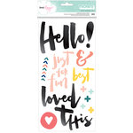
  • For a quick and easy way to get all of your stamped text centered perfectly, remember to stamp first, then glue. It's much easier to center your paper elements around a pre-stamped image or sentiment. 
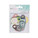
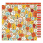
  • Emphasize the repetition of shape in your design. Nothing adds more fun to a layout than a burst of floating circles. Emphasize the circular design with alphabet stickers, buttons, or sequins. 
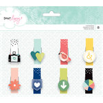
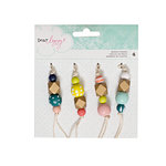
  • Add a final layer of texture to your layouts with a sprinkling of buttons, sequins, or enamel shapes. The final touch is an important one! 


Creating colorful pages with textured elements is a fun way to tell a story! Thanks so much for stopping by and watching today. Now go break out your "Starlight" Kit and get to creating!


September 12, 2017

Personalized Color | Felicity Jane Heidi Kit


I love the fall feel of this month's Felicity Jane kit, Heidi. The first thing that caught my eye was those beautiful colors in the solid cardstock sheets. I knew that I wanted to highlight them and put them to good use! Since I was thinking about color, the idea to create little paint chips came to mind. What better way to showcase color than to create a custom, pretty palette of fall hues.


I created white boxes that are 1.5" wide by 1.35" tall, placing custom titles in the lower half. This personalized the story and embellishment. Using a very plain bolded Arial font for the title at the top is key in creating a nice clean look just like the Pantone color chips. I repeated the date at the bottom to keep the chips uniform. Gathering all the bits of color and spacing them to create a background layer for the focal photo to lay on was the key in this design.


To place some weight just behind the photo, I used a tag and envelope to ground the title and add a bold pop of blue to the layout. The script yellow title is held in place by the aqua strip die cut and the pretty yellow flower. To add a bit of design flair, I added a tassel attached with embroidery floss to the tag. This gives this area a pop of movement and something fun!


A sprinkle of circle die cuts (a contrasting shape), hexagon wood veneer and some left over puffy triangles completes the design. That scattering gives the boxy background so much needed movement. Contrasting shape is an easy way to achieve that.


Custom paint chips can be used in so many ways. Think of the possibilities for birthday, Christmas and baby layout. When you are looking for a clever way to put the kit solids to work - create a color chip!

July 25, 2017

All About the Words + Felicity Jane

I love a good story. The words are one of my favorite parts of scrapbooking. I know that journaling can be tough for lots of crafters. It's so easy to get lost in the beauty of making, sewing and painting on layouts. I admit, I have pages that are totally art and light on words. Neither approach is 'right or wrong', they each tell their story in a different way. I like having a mix of both types of pages in my scrapbooks. Let's see what kind of story we can tell with the Kate kit this month.
Kindness by @nancydamiano | @felicityjane
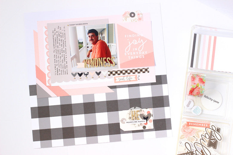
I focused this one on a favorite photo of my husband. When I looked at it, the first thing that came to mind was "kindness". That was the springboard for all of the words. Meaningful journaling doesn't have to be lengthy or complicated. Speak from the heart and those are the words worth recording.
Kindness by @nancydamiano | @felicityjaneNow that we have the words figured out, let's take a look at the design. I started with the bold black and white check pattern. I thought it would be a great contrast to all of the pale colors in this palette. I'm not afraid to make boy (or men) centered pages with feminine touches. I focus more on the feel or vibe that I'm trying to convey, rather than automatically match masculine colors. 
Creating layers around the focal photo is something I do frequently. Once I layed down the patterns and placed the title right in the photo, I lined up a row of hearts to underline the photo. They needed a little extra something and that was fulfilled with the 'dots' from the letter i's and exclamation points from the gold alpha. It's a simple touch that gives the design a special touch.
Kindness by @nancydamiano | @felicityjane
To balance out the heaviness of the top of the layout, a simple embellishment was created in the lower right hand corner. Layering a tag with a vellum circle, some stickers and an enamel heart is a great way to create a custom subtitle to a design.
Kindness by @nancydamiano | @felicityjane
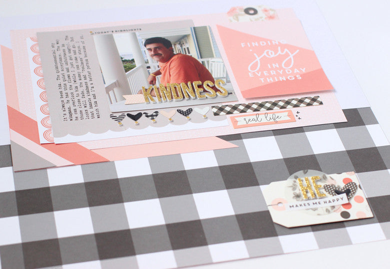
Combining good, solid design and a meaningful story is a beautiful way to remember someone special. I love that Kate has beautiful intricate embellishments and patterns that are perfect for any story - even for the men in your life!

April 12, 2017

Tiny Banner Love + Felicity Jane Caroline Kit

I've been working with some beautiful things lately. First up, let's take a look at the  in the new Felicity Jane May Caroline kit today. I love this color scheme. Actually, I've loved just about all of the FJ color schemes. They are soft, pretty and feminine, but not so overly feminine that I can't use them for my everyday layouts (including the boys).

This is Us by @nancydamiano | @felicityjane

I tried my hand at a banner that was a little 'different'. Banners were a trend that blew up a few years ago. I challenged myself to do take another spin on them. 
This is Us by @nancydamiano | @felicityjane
I try to think of products 'outside of the box' that they were intended! For example, the rubber charm hearts in this month's kit. That opening in the center makes them perfect to string along my banner. The add that unexpected design element that makes layouts pop. To anchor the banner, use two puffy hexagon shapes with a punch of color. And to add a dainty something, you can't go wrong with a suede bow.
This is Us by @nancydamiano | @felicityjane
The title is a smash up of my favorite things in the Caroline kit. I started with that bold aqua alpha and worked from there. For contrast, the script silicone charm was perfect. And for pops of color, the yellow flower die cut and puffy arrows were perfect. The stacked title balances out the photo, paper layers and the banner.
Create banners with your favorite bits and pieces to decorate your stories!

March 29, 2017

Painted Butterflies and Golden Bees| Studio Calico Kit

I don't do plain, it's just that simple. It's not in my genes! I'm a color and pattern and texture girl so when I come across wood veneer, I immediately want to alter it. So when I came across this butterfly border in the Studio Calico Birds and the Bees, I thought - paint!

I used washi tape to mask of one section of the butterfly at a time to create this black and white speckled beauties. The trick here is to let each section dry completely before masking. This takes patience and a little paint. I chose the colors right from the photo. The artist who painted that mural has awesome taste.

The rest of the design is very simple. Lots of layers under the photo so that it doesn't get lost amongst the butterflies. A few circle chipboard sentiments scattered here and there plus some journaling strips.


I added the transparency alphabet and some stamped sentiments right on the wood to finish off the layout. This was a fun one, the painty ones usually are. 


My second Birds and Bees kit layout is this one about coffee and Hawaii, two of my favorite subjects.  This one is all about that gold bee vellum. Swoon. I cut it up into different sized squares and just layered my heart out.


Next came a row of chipboard circles in different colors along the top center of the design. I thought of these almost like a stone path that led to the photo and story. I love that it breaks up the "softness" of the vellum.


I love the botanical feel of this one. It goes perfectly with the photo and the story. I struggled with this one a little. That happens sometimes when I'm using something I really love (gold bees!). The perfection gene takes over and that just makes creating so much harder than it needs to be. I keep reminding myself but it's hard to beat back that perfection monster!

I have two more project life spreads that I made with this kit, I'll be back soon to share.


SUPPLIES | Studio Calico March Kit - Birds and the Bees

March 28, 2017

Designing a Page | Elle' Studio March Kit


Circle, circles, circles. I haven't met one I didn't love. It's one of my design go to's when I want to create a quick bold look. So this month when I opened my Elle's Studio March kit, the first thing that hit me was this collection of large vellum circles in navy, aqua, lime, and sunshine yellow. Complete with sentiments in the center - hello beautiful!


I thought about the words and shuffled around the colors a bit when looking through photos I keep aside to scrap. The one of the kids jumped out at me - it went perfectly with both. They are still very much at a monkey-see, monkey-do stage and in this photo their sense of humor and bond comes shining through. This is what I wanted to say and now I had just the right kit to do it with - thank you Elle's Studio!

So first things first - I lined up those beautiful vellum circles photo right underneath the photo to call attention to it. That decision led to lining everything up in the center of the page - so that's where I went next.


Up at the very top I centered everything. An aqua acrylic star, the acrylic friends title and some stamped sentiments. They all frame out the photo, add texture and pops of color. The centering ties everything together.


Once I had everything lined up, I was thinking about "what am I going to add that's a little design twist." That's always the goal when I'm creating. I had a package of the kit sequins right next to my workspace and though, "hey, what if I just put the package right on the page?". That led me to create a small shaker out of a divided page protector. I tucked it right under the photo and I think it lends that element of interesting and pop of color. Clear pockets filled with fun are always fun.


And that's it - the story of how the layout came to be. It's so easy to create when the hard work of design has been started for you. I can always, always count on Elle's Studio to give me great colors and shapes to work with. That's half the design battle right there! Check out more beautiful designs by Elle here.

Thanks for stopping by! Coming up tomorrow I have painted butterflies and art. See you then.

November 30, 2016

Counting Down the Snow + American Crafts

American Crafts Dear Lizzy Nancy Damiano

There's no denying it, snow season is here! This is not my favorite time of the year in the Northeast, but I go with it and can appreciate the beauty and quiet that snowstorms bring. I wanted to highlight that with this photo of my husband and son sledding behind our house. Notice that I'm taking the photo from my nice, cozy home!

American Crafts Dear Lizzy Nancy Damiano

The idea for this page came from these numbered Dear Lizzy chipboard tags. They are my favorite embellishment from the Saturday line and I wanted to highlight them. What better way to do that then to tell the story of all the blizzards we plowed through last season.


American Crafts Dear Lizzy Nancy Damiano

I love how versatile these are - you can use them to count down any theme. They also add a really nice splash of color to the crisp, white background.


American Crafts Dear Lizzy Nancy Damiano


This page design is clean and graphic. The black and white title gives it a nice clean look. By layering a script title from Dear Lizzy Hello and a smaller, plain Dear Lizzy Petals Thicker font, the title is bold and balanced. I love how the Dear Lizzy Petals Thickers look like "snow" is falling right in the letters. 

This story is a reminder to appreciate the little things that the coldest season of the year brings. Frostbite and all. 

SUPPLIES | click on the photos for more info:


American Crafts - All Wrapped Up Collection - Christmas - 3 Dimensional Stickers - Snowflakes - White American Crafts - Saturday Collection - Chipboard Tags American Crafts - Saturday Collection - Thickers - Hello - Multicolor     American Crafts - Saturday Collection - Thickers - Alpha - Petals - Black and White 

November 9, 2016

American Crafts + The Gratitude Season


I'm getting the house ready for the big gathering next week. I love the anticipation and prep of this time of year. It's when I really think about the things that I'm grateful for, drink pumpkin spice lattes and wear boots and soft sweaters for the first time. I drink in this season - the one before the dreaded freeze.


This layout celebrate all the things that I love about right now. Things I'm grateful for, the traditions of Fall! I used a mixture of American Crafts Dear Lizzy and Shimelle collections to create this cozy layout. 


I was going for warm and cozy with a splash of color. Using these fun wood clips from the Saturday collection adds a pop of color and texture to this Autumn themed photo. I love the whimsy of the bird icon.


The chipboard title is also from the Dear LIzzySaturday collection and features this bright yellow “I love right now”. The bright color and sentiment is a great nod to the heme. I love that scripty font. I used a steel die to cut out the leaves and I love how intricate they are and how easy it was to press them out of very thick cardstock.


Combining fall patterns, colors and embellishments is a great way to tell your story and create layouts that both meaningful and easy to make. Celebrate all the things you are grateful for this season.

SUPPLIES | Click on the photo for more info:


American Crafts - Go Now Go Collection - 12 x 12 Paper Pad   American Crafts - Go Now Go Collection - 12 x 12 Double Sided Paper - Park  American Crafts - Saturday Collection - Icon Clothespins     American Crafts - Saturday Collection - Thickers - Hello - MulticolorAmerican Crafts - Saturday Collection - Puffy Stickers - Mini IconsAmerican Crafts - Saturday Collection - Beaded StrandsAmerican Crafts - Oh Happy Life Collection - Cardstock Stickers - Accent and PhrasesAmerican Crafts - Go Now Go Collection - Enamel Dots - Hearts, Stars, Dots