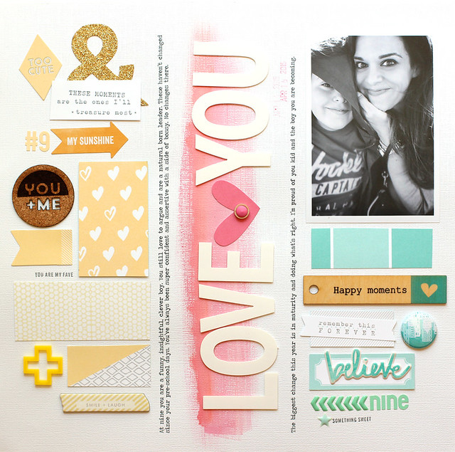
COLLECTION | Elle’s Studio Cienna
STORY | Documenting my son’s personality at age nine. Some of his strengths and improvements and things that drive me crazy.:)
DESIGN | I started with the idea of arranging elements by color. There are two dominant colors in the Cienna collection that I love – buttercup yellow and mint. I added the splash of pink down the center to emphasize the title.
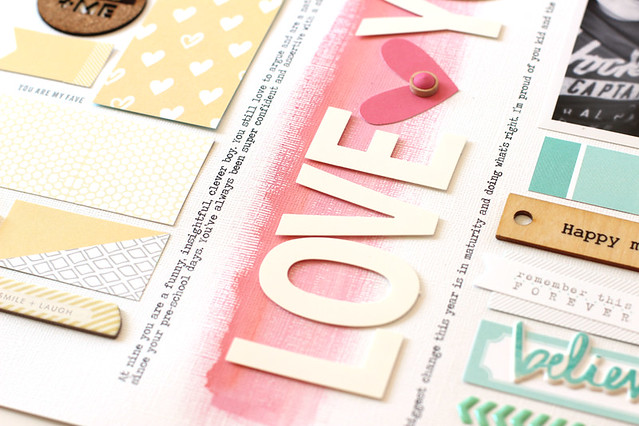

To create the painted ombre effect in the center I used the Jillibean Happy Hues paint in Precocious Pink and then a simple line of mango Gelato paint that I blended into the acrylic paint. This painted base makes the large white title pop.
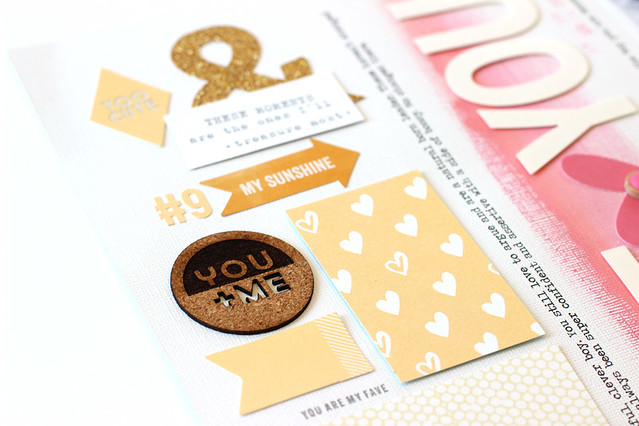
The yellow and mint sides are filled with bits and pieces from the Cienna collection, exclusives from past kits (cork, acrylic and flair) and 4 rectangles of patterned paper.
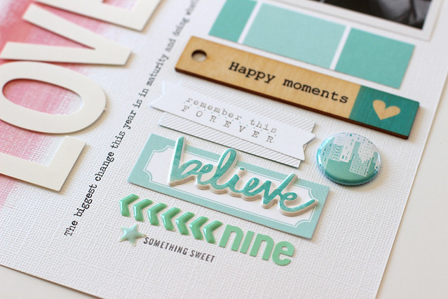
Separating elements by color is a fun way to include an eclectic mix of supplies on a page and frame a favorite photo!
SUPPLIES | Patterned Paper: (Elle’s Studio, Cienna, Lots of Love) (Elle’s Studio, Cienna, Patchwork) Embellishments: (Crate Paper, Craft Market, 12×12 Chipboard) (Elle’s Studio, Cienna, Bits & Pieces Die cuts) . Stickers: (American Crafts, DIY@ Shop, White Subway Alphabet), (Dear Lizzy, Serendipity, Puffy Stickers), (Jillibean Soup, Red Raspberry Soup, Cardstock Stickers)(Elle’s Studio, Letter Stickers, Yellow) (Elle’s Studio, Letter Stickers, Mint). Paint: (Jillibean Soup, Happy Hues, Precocious Pink) (Faber Castell, Gelato).


This page is SO cool! I love all the little bits and pieces! You are an awesome designer!
ReplyDeleteThis layout is pure perfection. Love the overall design of it with the columns and journaling in between. Also loving the color groupings for each column! So soft and pretty! :)
ReplyDeleteThanks for writing such a good article, I stumbled onto your blog and read a few post. I like your style of writing...
ReplyDeletetwistflex backdrops