COLLECTION | Crate Paper Kiss Kiss
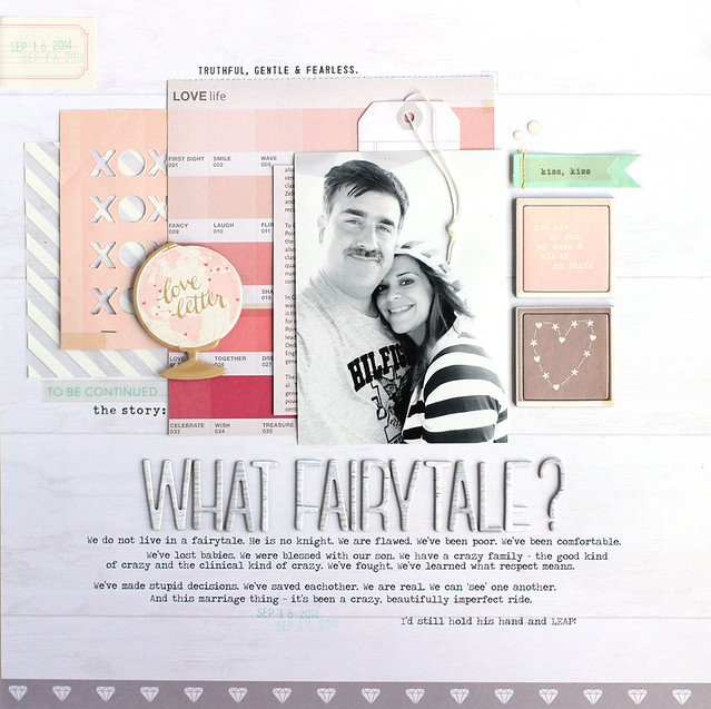
STORY | This layout started with a favorite picture. A selfie of my husband and I from this past summer. It was a gray, misty morning on the beach and the photo has this dreamy quality to it. That got me to thinking about our impending anniversary and the path that led us to here and now. It’s been good, but this has been no fairytale. I like real stories and real life, so that’s what I journaled about. Some warts, some great things and the sentiment that I would still do it all over again with him.
DESIGN | I began the layout with the color chip sheet of patterned paper from the 6×6 paper pad. The color gradient and simplicity of the design make it a favorite. From there, I layered a die cut journaling card, some chipboard, stickers and tags to create the center of the layout.

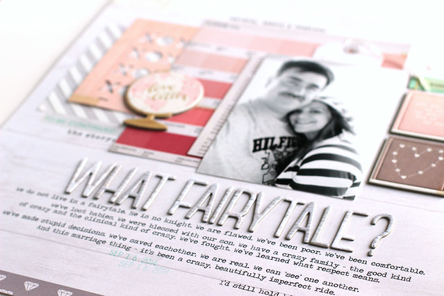
I framed out the photo by using two square chipboard frames in pink and gray. This keeps my photo front and center despite all the layers and embellishments surrounding it. The story is important here so I went with a bold, large title smack in the center. I like how these Thickers are a neutral, white and gray woodgrain and keep the bottom of the layout mostly white.
I’ve been playing with very soft colors lately which is a big change for me. I love the ethereal look of white pages and soft colors. It’s a phase. I’m sure I’ll be back to my usual bold palettes on the next round of layouts, but for now I’m enjoying it!


Gorgeous layout!
ReplyDeleteSimply perfect!
ReplyDeleteThis is beautiful! Love this "phase" - and your bold-colored pages too. Best of all - the journaling comes straight from the heart. The best kind. :)
ReplyDeleteThank you so much Cynthia!
DeleteSuch sweet journaling! Love how your B&W photo looks with these soft colors too! :)
ReplyDeleteThis is wonderful!!!!! The journaling made tears well up in my eyes. XOXO!
ReplyDelete