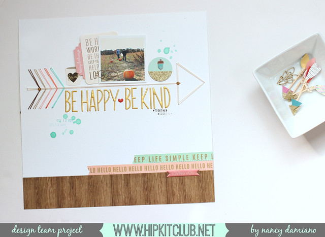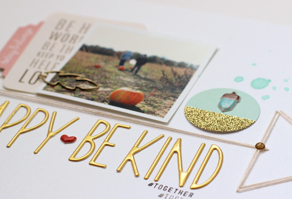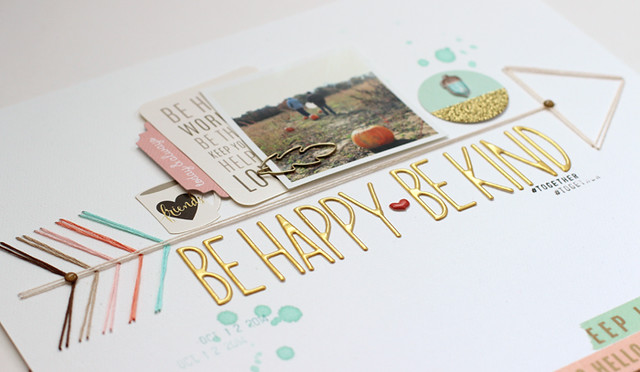
Here, the string arrow takes center stage. It divides the page in half. The top is all about the photo and embellishments while the bottom contains a large golden title.

Something else that's really different here is the lack of journaling. I think that's a first for me. One that I probably won't repeat very much, because I like words and stories way too much. I know great designers who are able to tell their stories without words, but that is so not me.

The colors came from the October Hip Kit. It's all about aqua, coral, woodgrain and gold. It was a beautiful starting point!
SUPPLIES: October Hip Kit | Golden Alphabet | Cedar Lane Ephemera | Gold Leaf Clips | Foil Tape Pack


Beautiful and soft color combo. Even without any journaling (yep, a bit odd) it's your style.
ReplyDeleteSo beautiful. Just so beautiful!
ReplyDeleteThanks for the blog loaded with so many information. Stopping by your blog helped me to get what I was looking for. แทงบาคาร่า Big Gaming
ReplyDeleteI’m going to read this. I’ll be sure to come back. thanks for sharing. and also This article gives the light in which we can observe the reality. this is very nice one and gives indepth information. thanks for this nice article... ufa88s.info
ReplyDelete