Showing posts with label Pink Paislee. Show all posts

October 27, 2015

String Arrows + Hip Kit Club

My favorite kind of design is one that has that little bit something different. I definitely have a clean, linear style but I like change, and especially in design.

Arrowtagged

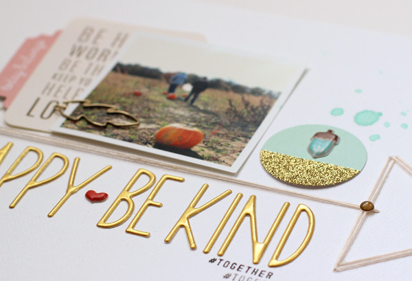
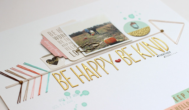
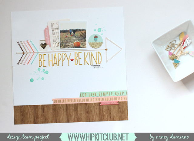
Here, the string arrow takes center stage. It divides the page in half. The top is all about the photo and embellishments while the bottom contains a large golden title.

ArrowDet1
Something else that's really different here is the lack of journaling. I think that's a first for me. One that I probably won't repeat very much, because I like words and stories way too much. I know great designers who are able to tell their stories without words, but that is so not me.

ArrowDet2
The colors came from the October Hip Kit. It's all about aqua, coral, woodgrain and gold. It was a beautiful starting point!

SUPPLIES: October Hip Kit | Golden Alphabet | Cedar Lane Ephemera | Gold Leaf Clips | Foil Tape Pack

January 19, 2012

Pink Paislee Snow Days + More Bella Peeks

We haven't had a flake of snow here yet - thank goodness! But I still remember last year when we had blizzards on what seemed like a weekly basis. The only good thing that came out of that frozen year, was stacks and stacks of fun snow pictures.
I made this layout for the Pink Paislee blog a while back using their new Snow Days line. I love how they used non-traditional winter colors and a little bit of kraft. I started the page by sewing rows of punched circles and photos to the background page. 
By alternating the color and sizes of the circle, it added dimension to the page instead of being a static row of the same sized circles - just something different. I placed the title right on a blank spot on the photo and embellishments on the bottom. This frames out the focal point photo and adds a bright splash of red.
 I'm not expecting (heck no), but Bella Blvd. is! Check out their latest line at the Bella Blvd blog  and leave a comment to win the collection. There are also detailed shots and sample pages.

Love that little sonogram!


December 7, 2011

Farewell Pink Paislee

I remember how excited I was when I got the email from Pink Paislee asking me to join the team last year. I was so excited! They were one of my favorite companies and I was looking forward to working with them. It's was a great opportunity for me and an excellent company to work for. I can't believe it's been a year already! Time to move on though and explore different opportunities and mediums - and I'm really looking forward to that.

Here are a few of my Pink Paislee projects that I recently completed.
Using the Nantucket line and Coredinations cardstock to make this vacation page.
I made this "heart" you page using the 6x6 pads from the Vintage Vogue and Nantucket lines.
Using the "stitched heart" shape and the Silhouette Cameo. Love how clean this machine cuts intricate shapes!
And my last page, using the Vintage Vogue line on this page about my grandparents' love story.
I love how this turned out, even if my picture isn't the greatest...
If you'd like to work for a great company and be part of an amazing team, I would encourage you to visit the Pink Paislee website and apply for their new 2012 design team. I couldn't recommend them enough!

August 24, 2011

Pink Paislee Nantucket - Captiva

I have a quick post today featuring Pink Paislee's Nantucket line again. I did an "inspired by" layout of our time in Captiva. To read more about the details of how I came up with the layout idea, see my blog post at Pink Paislee.
Sometimes it's the simplest moments from a vacation that I remember the most. On this particular day, we took a ride from Sanibel to Captiva Island. There was a funny story about a conversation we had that I wanted to remember. The pictures support the story and the products I used on the layout convey the "feel" of Captiva.
In case you're interested in the story behind the page, the journaling reads:
Do  you remember when we ventured out to Captiva for dinner one night? I wanted to see the sunset and have dinner at the Mucky Duck. And you wanted to stop and see the manatees at the pier. The manatees were amazing, the sunset beautiful and the wait at the Mucky Duck 1-1/2 hours long. Do you remember how all of the mega-mansions on the way had fancy names and when I asked you what you would name ours, you said "Ain't Po' No Mo'." And that right there is why I love you. Because I get you and no one can make me laugh like like you do.

Up next, a school page and Design School Classes over at twopeasinabucket.com!

August 11, 2011

Pink Paislee's Nantucket

My poor neglected blog. It's a victim of the summer and very hot weather we've been having in the Northeast. We escape every day to the beach, the waterpark or anywhere we can cool off. Nico has just started summer camp this week for the first time so I've finally had some down time.

I sat down this week and made a page with Pink Paislee's new Nantucket line. It's one of the very few tropical lines that came out in 2011 and I was so happy to dig right in. I started with a page about our trip to Mexico two years ago. It's just a general overview page of the things that we loved, the beach and some of our favorite things.
The entire page was built around the honeycomb shape chipboard embellishment. One of my favorite Pink Paislee products ever. To keep the shapes perfectly aligned, I popped all of the pieces out and used the negative as a stencil. I lightly traced the hexagon shapes right on to the patterned paper and then simply stuck on all of my shapes.
To see a picture depicting exactly how I did it, you can visit the Pink Paislee blog and see my post dated 8/11/11. I deleted the photo before I got a chance to post it here. Sorry!
I also cut a few of those honeycomb shapes out and placed tiny, 1-inch photos behind the paper. I like the window effect and "peeking" through photos.
The title was created with Pink Paislee's Wood Shop letters and painted a bright aqua blue.  I added a few layers of die cuts and wood starfish from the Nantucket line to complete the page.

Thanks so much for taking a look. I'll be blogging on a much more regular basis now that summertime is winding down. I am so looking forward to spending more time creating. I miss it!

July 18, 2011

Pink Paislee Sneaks

I'm still here. Enjoying the summer season and hosting the longest sleepover ever. My niece and nephew have been with us for 2 weeks and we've been everywhere! I'm exhausted, beyond tired, but happy. In my "spare" time I stayed up way past midnight to work on some CHA projects for Pink Paislee last week.

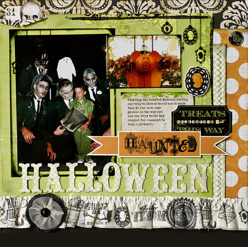
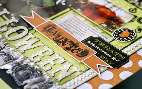
This is their new Halloween line Phantom, which was perfect for pictures of Nico at the Haunted Mansion two years ago.
I love the big polka dot paper with its faint grid background. I used the plain Mistables fabric border and stamped coordinating images with Staz-On ink. I really like the custom look that it adds to the page.

Here is a closeup of some of the die cuts and clear frames from the line. I added some pop dots here and there for dimension and some stitching for a pop of black.

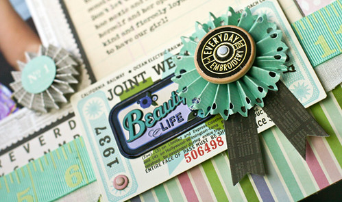
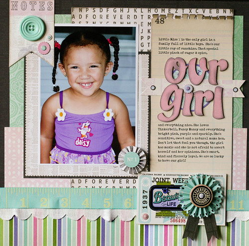
Here is a close up of my page using the Vintage Melrose line by Pink Paislee. The aqua flower is a pre-made embellishment and I added the wooden button (also from the line) and black ribbons.
One of my favorite products from Pink Paislee are these new wood letters. I added some pink paint and then sponged them with light grey ink to match the page. I love that the colors are vintage with just enough of a modern twist.

I'm currently working on a page using Pink Paislee new Nantucket line - which is my favorite! I'll be back soon (after I take a nap)...

June 27, 2011

Pink Paislee's Mistables Sneak Peek

When I first got this new 'Mistables' line from Pink Paislee I really had no clue what to do with it. I am so not a mister. I probably own a total of 6 mists and very rarely use them. And then I started playing and fell in LOVE!

Believe it or not, every single product on this page started out a plain white canvas.
I used Aquamarine, Silver Mist and Dark Denim mists by Tattered Angels to add the color. My favorite is the patterned paper. It has a natural resist pattern already built in to it. You just mist it and watch it completely change. So cool! The muslin flower and scallop border trims soak up the mist really well for deep, even coverage.
 Here is a peek at the new line in it's plain vanilla state. It's coming to a retailer near you soon, so watch out for it! You can also get a better look at it on the Pink Paislee blog.

June 6, 2011

Daily Junque & Straw

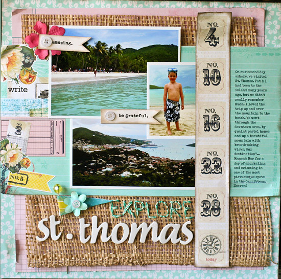
I just posted a recent assignment over on the Pink Paislee blog using the Daily Junque line. I love the colors in this line and they remind me so much of the quaint houses in St. Thomas, that I knew just the layout I wanted to do.

I layered lots of different patterned papers from the line until I had a nice summer palette. I then bought a cheap straw placemat at my local dollar store and cut it up to use on the layout.
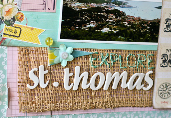
 I used the Daily Junque twine to sew part of the title right on to the layout. The twine is just thin and silky enough to go right through the straw mat.
Lastly, I added some flags from the Daily Junque ephemera pack, buttons and paper flowers to draw the eye through the layout.
This page came together quickly once I added the straw mat. It really added the island feel and "pop" that I was looking for.

Thanks for stopping by!

May 28, 2011

Hi everyone! Happy Memorial Day weekend. I hope your weather is as nice as ours right now & you are out enjoying it!

I have a really quick project that I made for the Pink Paislee blog today. This is a candy centerpiece that I made for Nico's birthday party this summer. I love how it's decorative, personalized and good to eat.
 
I love these chalkboard stickers and they were really easy to cut with the Cricut Expression.
For more details and sizes, please visit the Pink Paislee blog here.

Have a great one!

April 14, 2011

Pink Paislee & Disney

My assignment this week for the Pink Paislee blog was to add designer details to a page. I had a lot of fun coming up with this Disney page using the Hometown Summer collection.
 

I used rows of stitched Mickey head punches to two squares on the page. Then added yellow brads for a pop of color. I think this adds an interesting little detail to the page.
 
Finally, on the last embellished square I added my journaling. I used a metal flag from the Soiree collection and die cuts from Hometown Summer to make a frame of sorts for the journaling spot. It draws the eye, adds decor and is functional all at the same time!
 Thanks for taking a peek at my blog. Be sure to check out the Two Peas Garden Girl blog tomorrow for my "In Review Challenge". I hope you get a chance to play along!

March 31, 2011

Pink Paislee Hometown Summer

I've been working with this new Hometown Summer line by Pink Paislee this week and I can't even tell you how much it's making me long for summer. I love the bright colors and fun icons in this line. It was perfect for scrapping these pictures from last summer.
Click on the picture for a better view.
I remember that it was the first time that all 3 of the kids were brave enough to jump into the pool. And they did that over and over and over. It's amazing how they never get tired of it. Naturally, it comes with the screaming "look at me, look at me, take my picture." So I knew I had to get the story down on a page.
I was inspired by a home decor piece I spotted on kreyv.com that had a jumble of letters falling all over a frame. I used the same concept to make my title a little more interesting.

I like how the letters are literally “jumping in” to the page. I used white embroidery floss to add a bounce line and a place to ground the title. I placed the letter stickers on pop dots so that they would stand out from the busy red background.
I cut up the wave patterned paper to make a wide border for my page. I added several overlapping layers and inked the edges with a light brown stamp pad for dimension.

This was such a fun, bright page to make. Summertime memories and pages are my favorite things to scrap. I look forward to the coming season.

I just finished editing my first video and will be posting it on Monday. Hope you like it!

March 12, 2011

Pink Paislee Daily Junque

I just posted this page over on the Pink Paislee blog this morning. My assignment was to journal a story and lucky for me, that's one of my favorite things to do. I made this page depicting the different stages and roles that I've played over the past two decades.  I want Nico to know that Mama had this whole big life before he became my world.
I added my own handwriting to the layout which is something I rarely do. But I think it's important and adds a personal touch.
My favorite part of this layout is the top border. I made the file out of kraft cardstock and then layered bits and pieces from the Daily Junque Ephemera and Labels packs. It's like a collection of things we gather in our everyday life. Love that!

I've got a busy decorating weekend ahead of me. I'll be back on Monday with a Two Peas in a Bucket project.

February 23, 2011

My Favorite Girl

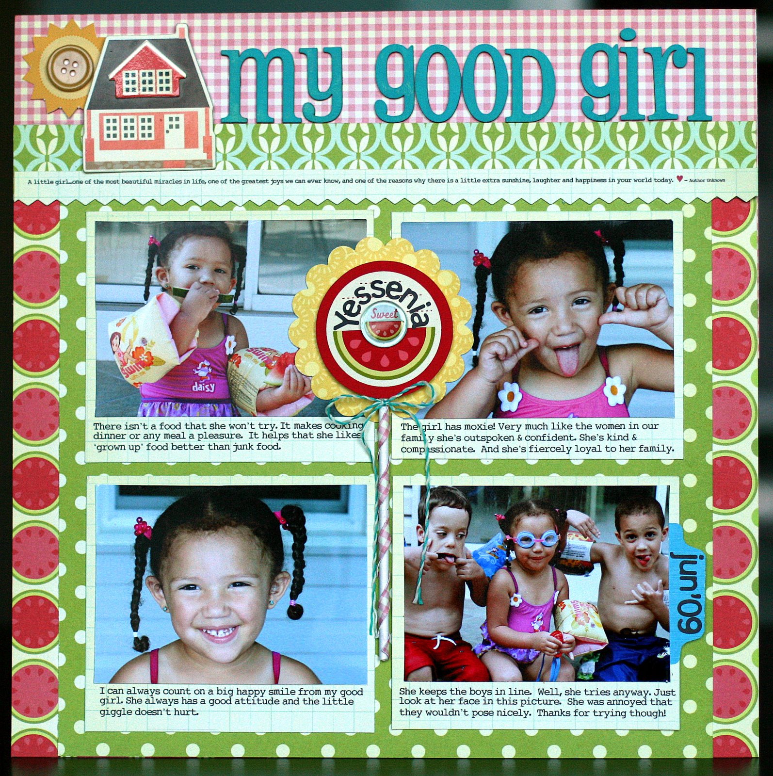
I am so very ready for winter to be over! While I still can't put away the coat (or my socks), I can move on in my scrapbooks and work with some bright and sunny supplies. I love this Hometown Summer line by Pink Paislee. It's my favorite summer line released at CHA! You will see me use it over and over all season long. I don't think it's available for purchase yet, but I'm pretty sure that 2Peas should have it in the coming weeks.

This page is about my little niece and what a good girl she is. Her little spirit adds so much to my life and to our family.  I decided to journal right underneath the photos, since each one depicts her personality and what I wanted to express perfectly.
This layout was made for the Pink Paislee blog.
My favorite part of the layout is this lollipop that I created from a die cut, a picture pebble, the large flower punch from EK and a white cookie pop stick. I bought the stick at Michaels and everything else is from the Hometown Summer collection.  I added a strip of patterned paper and wound it around the stick for a pop of color.
Click on any of the pictures for a closer look.
These wood letters are from Pink Paislee's Daily Junque line. They are raw wood and I painted them to match my layout. I love the size and how I can customize them. I also added a quote to that skinny strip on my layout for a finishing touch. It reads:

"A little girl...one of the most beautiful miracles in life, one of the greatest joys we can know, and one of the reasons why there is a little extra sunshine, laughter and happiness in your world today. – author unknown”
This was such a fun, happy, bright line to work with. Is it summer yet? :)

Be back soon...

January 27, 2011

Pink Paislee Daily Junque

I have one more new line from Pink Paislee that I've been working with for CHA. It's called Daily Junque and I think you will really love the colors and patterns in this line. It can be used for anything, but something about the pink/aqua/navy combination reminded me so much of our time in Sanibel, Florida last year. My husband and I fell in love with the place and we've pretty much decided that someday, if we are fortunate, we will retire to this little haven. The story and the Daily Junque line inspired me to create this...
I used Glimmer Mist for the first time on the wood letters that spell out "Sanibel". Tattered Angels is making mists to match the colors in the Daily Junque line. Pink Paislee will be giving away a set of the entire line. Enter to win by leaving a comment on their blog today.
That's all I have for today. I'm off to sunny Los Angeles for the CHA Trade Show this weekend. Watch my blog for pictures and updates from the show. Leave me a comment if there is a specific booth or release you'd like me to take a picture of and I'll try my best to cover it!

I will also be reporting for the Two Peas in a Bucket CHA Social Event on Saturday.

Have a good one and wish me luck getting out of a very snowed-in Newark airport!

January 25, 2011

Pink Paislee Reveal

So I've been up to my ears in CHA projects and I'm excited to finally be able to show a tiny sneak peek of what Pink Paislee has coming up.

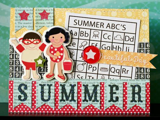
These are two cards that I created with the Hometown Summer line. It's my favorite release! I can see  using this for tons of my summer layouts this year. I love the vintage feel and bright colors.

Keep in mind that I am so NOT a cardmaker. I've made a total of 6 cards ever, so this was a bit of a stretch for me. Hopefully, I did the line some kind of justice. Ha!
For a closer look at the entire line and a chance at winning everything shown below, visit the Pink Paislee blog and leave a comment today. Good luck!

January 15, 2011

Pink Paislee

My first assignment over on the Pink Paislee blog was to choose a Live Pink gallery page and scrap lift it. I chose this beautiful layout by Kathie Link. I love the design and layering that she did. It inspired me to come up with this Valentine's page.
This page is about my niece and how I've been sending her a Valentine's Day care package every year since she was born. They started out filled with bibs and rattles and now it's all Hello Kitty and American Girl pets. I love this tradition and I'm happy that's its finally made its way into my scrapbook.
Click on the picture for a close-up view.
I used the Sweetness line by Pink Paislee exclusively. For more info, you can read my post about it here. And thank you Kathie for the inspiration!

December 28, 2010

I am Tickled Pink!

So very happy about this...
I love Pink Paislee and I can't WAIT to get started on this team. Have you seen the sneak peeks for CHA Winter...
I love them all, but I think they made Hometown Summer and Daily Junque just for me! ;) Wish me luck on my very first manufacturer's design team. I think it's going to be fun!