June 27, 2011

Pink Paislee's Mistables Sneak Peek

When I first got this new 'Mistables' line from Pink Paislee I really had no clue what to do with it. I am so not a mister. I probably own a total of 6 mists and very rarely use them. And then I started playing and fell in LOVE!

Believe it or not, every single product on this page started out a plain white canvas.
I used Aquamarine, Silver Mist and Dark Denim mists by Tattered Angels to add the color. My favorite is the patterned paper. It has a natural resist pattern already built in to it. You just mist it and watch it completely change. So cool! The muslin flower and scallop border trims soak up the mist really well for deep, even coverage.
 Here is a peek at the new line in it's plain vanilla state. It's coming to a retailer near you soon, so watch out for it! You can also get a better look at it on the Pink Paislee blog.

June 21, 2011

Crate Paper Family Portrait

Our assignment this month over on 2Peas was to create  a layout with a wedding theme. Now I have have plenty of wedding pictures to scrap (probably hundreds), but I've been intimidated by the project. It seems so daunting and I have no journaling from the time, so some of the stories have been lost.

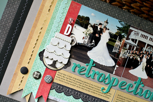
I was looking over my proofs trying to get inspired and I kept laughing at some of the photos. I remember this being the 'wedding of my dreams' but now it seems that everything was "too much". Too much dress, huge flowers, poufs, huge wedding party...this is so not the wedding I would have now. So that's the story that I went with.
This layout is copyright Two Peas in a Bucket.com
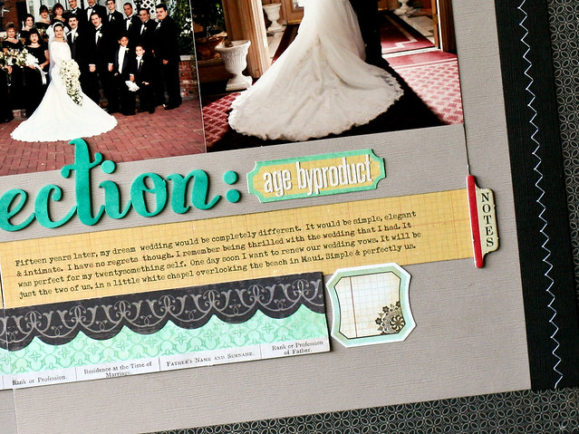
I think the title says it all -  Retrospection: Age byproduct. I used 3 wedding proofs to tell the story and one of my favorite lines - Family Portrait by Crate Paper. Love the bold, non-traditional wedding colors.
The chipboard wedding cake is from Crate. I added the stick pin and an alphabet letter sticker "D" to personalize the cake. I cut three long strips for my ribbons and attached them with fabric brads. I used Thickers for the title and sponged them lightly with brown ink to tone down the bright teal color.
Next, I added strips of patterned paper and stickers to create a border along the bottom of my page. For a complete list of the products I used, you can click here.

Thanks so much for stopping by! I'll be back soon with some everyday life pics and a little Rocket Age.

June 17, 2011

Cricut Hello Thursday...or Friday

I've been missing around here! Just busy with end of school year stuff and enjoying this beautiful weather. I've been doing most of my scrapbooking at night and let me tell you -- I am TIRED! It seems as if once I start a project, I can't pull myself away until I'm finished. I've got alot of fun pages coming up to share with you in the next two weeks, so stay tuned!

Today, I have a Cricut blog page to share with you. This page is about my son at the beach when he was little and how silly he was. I remember how much he loved the sand and especially eating it. Yuck!
The red title, wave, surfboard and suns were all created using the new Cricut cartridge CM Traveler. You can see more of the images from this cart at Cricut's official blog here. All of the paper is from My Mind's Eye. I love the bold images and titles in this cartridge.
And this is a Father's Day card that I made for Pink Paislee with the Daily Junque line. The small envelope is actually the ephemera packaging, but I used it as the base of my card. I also used the Cuttlebug Seeing Spots folder to create the background.
Thanks for bearing with me through this little hiatus. Hopefully, I'll get on a better blogging/crafting schedule even if my sleep suffers for it.

Have a great Father's Day weekend!

June 6, 2011

Daily Junque & Straw

I just posted a recent assignment over on the Pink Paislee blog using the Daily Junque line. I love the colors in this line and they remind me so much of the quaint houses in St. Thomas, that I knew just the layout I wanted to do.

I layered lots of different patterned papers from the line until I had a nice summer palette. I then bought a cheap straw placemat at my local dollar store and cut it up to use on the layout.
 I used the Daily Junque twine to sew part of the title right on to the layout. The twine is just thin and silky enough to go right through the straw mat.
Lastly, I added some flags from the Daily Junque ephemera pack, buttons and paper flowers to draw the eye through the layout.
This page came together quickly once I added the straw mat. It really added the island feel and "pop" that I was looking for.

Thanks for stopping by!

June 3, 2011

Echo Park Splash & Slide

I am just starting to tackle the mountain of photos and stories from our cruise. From the moment I saw this Splash line from Echo Park, I knew it would be perfect for these slide photos.
This layout is copyright Two Peas in a Bucket. com
The minute Nico saw that slide, he started begging to go on it. He had a blast going up & down & up & down, he met lots of new friends and got into trouble on that slide (you mean 3 boys can't go down the slide at the same time repeatedly? Ha!). Here I thought that the Nickelodeon shows would be his favorite thing about the ship, but no - it was the slide.
My favorite paper is the yellow sunburst and I thought it matched the color & feel of the slide. I cut out a portion and used it to ground the title. I had so many pictures of Nico going in every direction on the slide, that it was tough to fit them all in. I kept 2 large photos (4x6 and 4x5) and then used a series of small pictures to tell my story. I used the chipboard circles to create movement over the 2-page spread and draw attention to the focus of the picture. Add some chipboard and fun patterned paper and you have one fun waterslide page.
For a complete list of the products that I used, visit my gallery here.
Have a great weekend!