July 28, 2017

Watercolor | Two Different Looks

I've been experimenting with watercolors lately and while I have a long ways to go, I've learned a few things along the way. Today's post is about water and how the amount and how you color a card really makes a difference. Let's take a look at two very different look colored with the same medium. The first card is very clean and simple with a side of cute!


I used the new Schoolhouse stamp set to create this friendship card. I stacked three of the images so that the little mouse could "write" out the sentiment. I used a black pigment pen to create some swirly lines under and above the mouse to connect him to the design.

I used Kuretake Gambai watercolors to color in the images. I used very little water to get a very vibrant wash of color. I left some of the edges white to match the whimsical feel of the stamped images. It's a bold look for a clean card.


Now let's go in a completely opposite direction and use watercolors to add a very loose, flowing wash of color. Here the You're a Gem stamp set was used with white embossing powder to create a border at the bottom of the card. This offers a nice resist effect when layered with watercolors.


I used a clean, wet brush to add some water to the background and then added pink, yellow and orange watercolor paint. A spray bottle was used to spritz the paint to blend it. I love how all of the nooks and crannies in the gems filled up with beautiful color!

I love using watercolors to create very different looks. I like variety and this medium really delivers!

July 25, 2017

All About the Words + Felicity Jane

I love a good story. The words are one of my favorite parts of scrapbooking. I know that journaling can be tough for lots of crafters. It's so easy to get lost in the beauty of making, sewing and painting on layouts. I admit, I have pages that are totally art and light on words. Neither approach is 'right or wrong', they each tell their story in a different way. I like having a mix of both types of pages in my scrapbooks. Let's see what kind of story we can tell with the Kate kit this month.
Kindness by @nancydamiano | @felicityjane
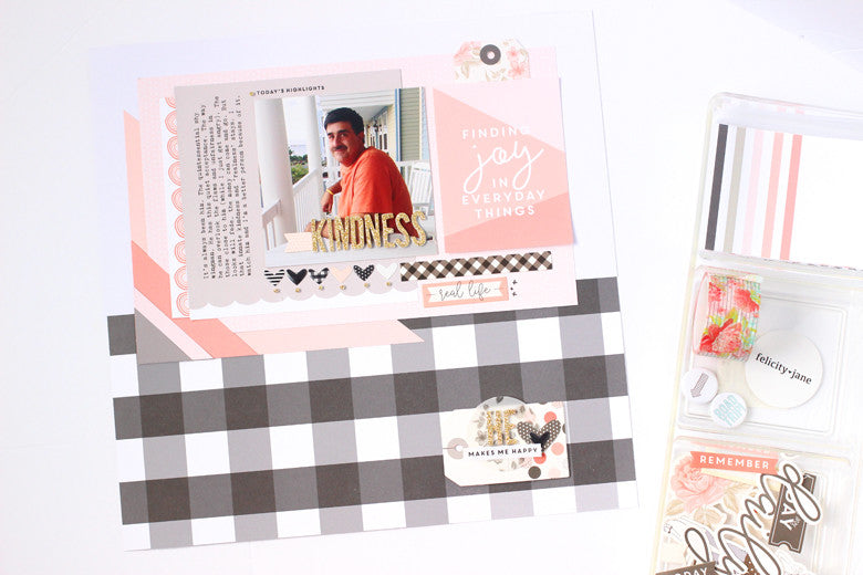
I focused this one on a favorite photo of my husband. When I looked at it, the first thing that came to mind was "kindness". That was the springboard for all of the words. Meaningful journaling doesn't have to be lengthy or complicated. Speak from the heart and those are the words worth recording.
Kindness by @nancydamiano | @felicityjaneNow that we have the words figured out, let's take a look at the design. I started with the bold black and white check pattern. I thought it would be a great contrast to all of the pale colors in this palette. I'm not afraid to make boy (or men) centered pages with feminine touches. I focus more on the feel or vibe that I'm trying to convey, rather than automatically match masculine colors. 
Creating layers around the focal photo is something I do frequently. Once I layed down the patterns and placed the title right in the photo, I lined up a row of hearts to underline the photo. They needed a little extra something and that was fulfilled with the 'dots' from the letter i's and exclamation points from the gold alpha. It's a simple touch that gives the design a special touch.
Kindness by @nancydamiano | @felicityjane
To balance out the heaviness of the top of the layout, a simple embellishment was created in the lower right hand corner. Layering a tag with a vellum circle, some stickers and an enamel heart is a great way to create a custom subtitle to a design.
Kindness by @nancydamiano | @felicityjane
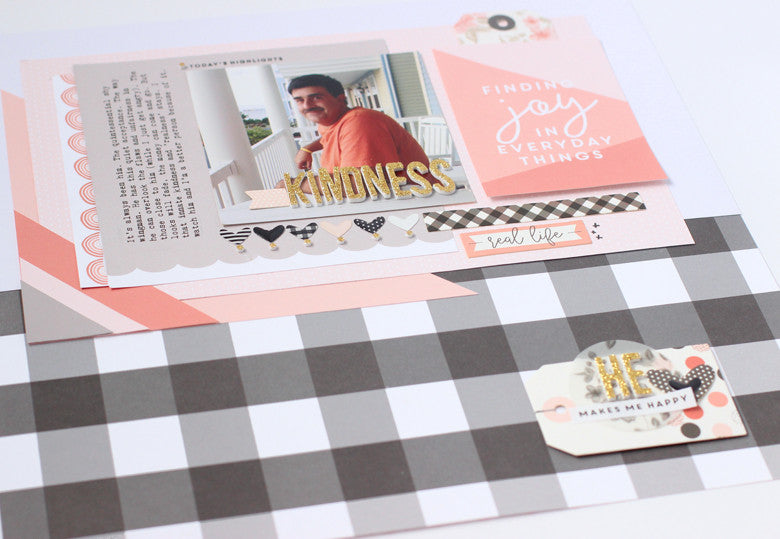
Combining good, solid design and a meaningful story is a beautiful way to remember someone special. I love that Kate has beautiful intricate embellishments and patterns that are perfect for any story - even for the men in your life!

July 8, 2017

Sunny Studios + Studio Katia Blog Hop Giveaway


Welcome to the Sunny Studios and Studio Katia blog hop. Both teams are celebrating Summer Time with fun and colorful shaker cards using stamps from Sunny Studio and dies and embellishments from Studio Katia.  There are prizes and a special sale too! Both companies have a prize to give away too so make sure you read all the way to the bottom of this post to see how to win!


I used the Magical Mermaids stamp set to create this under the sea card. The images were all colored with Copic Markers for a punch of color. The fun wave border was created with the Sunny Studios Stitched Scalloped Borders Steel Die.  The border was then colored with Distress Oxide Ink in Broken China


The Studio Katia Dotted Shaker Tag makes for perfect embellishments. Here. I placed it right over the wave border and filled it with a mix of Summer Fusion sequins. The colors really pop against the white background. A few sprinkles of sequins up at the top finish off the card. Now let's take a look at more inspiration from both design teams:

Have fun hopping!
Nancy Damiano - you are here!


As part of the blog hop festivities, Sunny Studio is giving away (2) $25 gift cards to two lucky winners.  Contest runs through Monday night with winners announced on the Sunny Studio blog on Tuesday, July 11th.

Sunny Studios is also having a 3-day sale with 15% off all purchases using the promo code "SUMMER15" through Monday night, June 10th 11:59 pm PST.


★GIVEAWAY!★

To celebrate this Summer Time Hop we are giving away THREE prizes:
One prize pack from Studio Katia and two $25 store credits from Sunny Studio! 

Here's how to win:
  • Comment on the Design Team blogs from Sunny Studio and Studio Katia (see a complete list of those participating at the Studio Katia and Sunny Studio Blogs).
  • Three winners will be chosen at random from the collective blog hop posts. Make sure to check out each of the blogs and comment for your chance to win. You will not know which blog has been chosen so the more you comment, the better your chances are of winning! 
  • You have until Monday, July 10th at 11:59 PST to comment - winners will be announced on the Sunny Studio and Studio Katia blogs by Wednesday July 12th.

July 5, 2017

Neat and Tangled July Release Day Three | School Hous

Hey there, welcome to the first day of the July Neat and Tangled release. The second stamp set up is called School House with the cutest little critters and sentiments.  My favorite from this set is the pencil which I centered the design around.


To create this card I used the Neat and Tangled School House stamp and die sets with Versafine Ink. Next, I colored a handful of images with Kuretake Gansai Watercolors. I used a masking technique to make a tower of staggered pencils. Each colored in shades of blue, with a green one way at the top. A school bound bear softly watercolored completes the stamped images.


The stacked sentiment was stamped in Onyx Ink. The card was layered with blue cardstock and placed on a gray base.   A few sprinkles of sequins finish off this school themed card.

Neat and Tangled will be giving away a School House stamp set. To enter, leave a comment below to be entered. Tell me what's your favorite cardstock colors are. Visit the Neat and Tangled blog on Friday for a list of winners. Good luck and thanks for stopping by!

July 4, 2017

Neat and Tangled Release Day 2 | You're a Ge

Hey there, welcome to the first day of the July Neat and Tangled release. The second stamp set up is called You're a Gem and it certainly is.  I love all of the different shapes and sizes included in this set. The beautiful, bold script is perfect for large sentiments.


To create this card I used the Neat and Tangled You're a Gem stamp and die sets with Versafine Ink. Next, I colored a handful of images with Dr. Ph Martin's India Ink. I love how bold the colors are! The gems were layered at the bottom of the card, some with a bit of foam tape for lift. 


The bold sentiment was stamped in Onyx Ink. The entire card was framed out and placed on stripped patterned paper. A few sprinkles of clear Dew Drops finish off this fun card.

Neat and Tangled will be giving away a You're a Gem stamp set. To enter, leave a comment below to be entered. Tell me what's your favorite watercolor brand is. Visit the Neat and Tangled blog on Friday for a list of winners. Good luck and thanks for stopping by!

July 3, 2017

Neat and Tangled July Release Day 1 | Together Stamp Set

Hey there, welcome to the first day of the July Neat and Tangled release. The first stamp set up is called Together and it's chock full of beautiful text. Perfect for titles of all different kids. I paired it up with Flamingo Floatie stamp set and Triangle Pattern Mask for a fun summer card.

To create this card I used the Triangle Pattern Mask and Oxide Distress Inks for a fun background. Combining the Neat and Tangled Together stamp and die sets is a great way to create a layered title. I used a blending tool to shade the top of the die cut title for a pop of color. The Flamingo Floatie images were colored with Copic markers and layered on the ink blended background.


A few sprinkle of sequins finish off this layered card.

Neat and Tangled will be giving away a Together stamp set. To enter, leave a comment below to be entered. Tell me what's your favorite summer stamp set is currently. Visit the Neat and Tangled blog on Friday for a list of winners. Good luck and thanks for stopping by!