December 1, 2015

Thankful + Hip Kit Club

I've been working and creating and moving my scrap space this month. Reflecting on what I'm grateful for and using up the beautiful warm October Hip Kit.

BelleHeartLayout

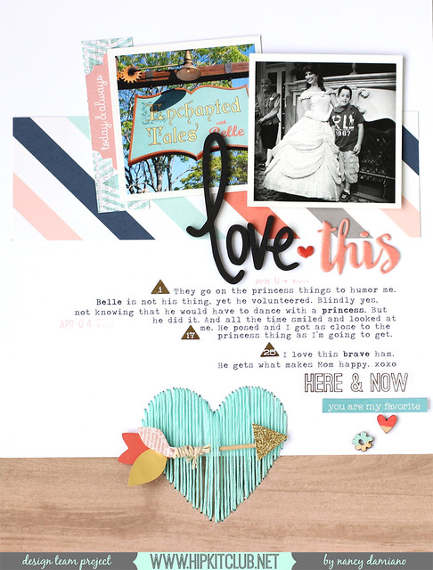
Love this photo and memory of my boy and his turn at dancing with a princess. He did it because he knew it would make me happy, and that means everything. It's one of those Disney moments that I tuck away for when he's grown.
BelleHeartDetail
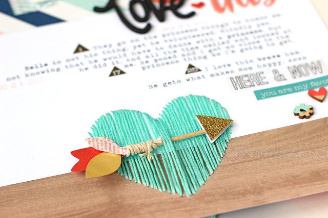
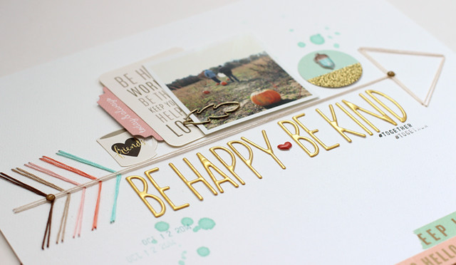
The design came from the title. I knew I wanted to do a heart, so why not make it a real focal point. Stitching it in aqua blue and placing it so that it marries the wood and white paper borders anchors the page. The arrow through the heart was a last minute addition. The heart was looking too bold, too solid and weaving the arrow softened it up and made it a little more interesting. My something different.

CardsFLower

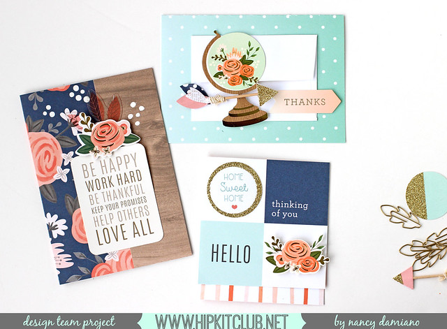
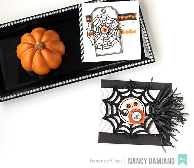
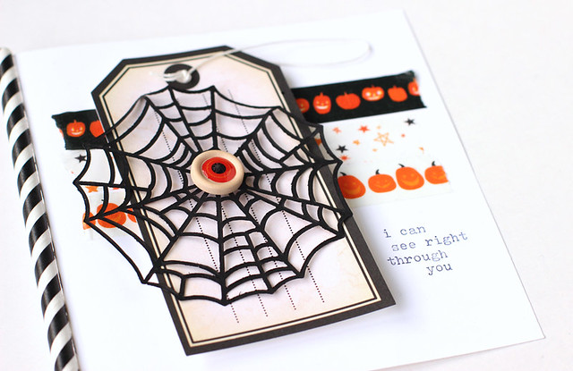
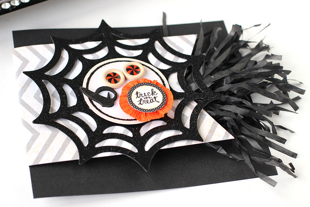
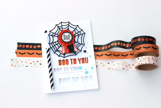
A trio of cards with some Pebbles paper and embellishments. It's nice to change things up and step away from making layouts. I like working on a smaller canvas and use up the bits and pieces that are leftover from my kits every month.

FavesPaintSwatch

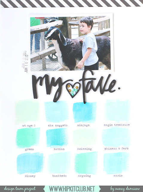
This was my artsy attempt at using the Prima Watercolor Pencils. Totally inspired by the many paint swatches that are up around my new scrap space. I used a typewriter to get the words to fit just right. This design is clean and simple. The idea of the paint swatch and enamel dots in the heart are the something different here.

SUPPLIES:  October Hip Kit | Pebbles Collection | Prima Watercolors | Script Titles | Wood Arrows | White Cardstock

October 30, 2015

Halloween Cards + American Crafts

I'm usually not a big card maker, but I do enjoy creating on a smaller canvas. It lets me practice layers and different techniques on a smaller scale. This month my assignments included three Halloween cards and these were some of designs that I came up with:

HalloweenCardsFull

This one is all about the words and silly joke: " I can see right through you." As soon as I saw that eye wood button, I knew that this would be make for a cute card sentiment. I may be spending too much time surrounded by 10-year-old boys.

HalloweenCardSeeDetail
I used a black and white straw here as a fake binding for the card. I like the punch of pattern and texture it added.

BooCardDetail
This card is based on a glittery spiderweb and some fringe. The fringe reminded me of spider legs and adds a whimsical fun touch to the design.

Halloweencard
The last card has a cut out title and a fun flag. I used a black and white party straw from the American Crafts Halloween line to create this spiderweb embellishments. A layered embellishment in the center and some fun splatters of paint make for a card that spooky cute.

SUPPLIES:  Die Cut Spiderwebs, Halloween Dimensional Sticker , Halloween Tape

October 29, 2015

Stitched Halloween + American Crafts

I've been on a stitching kick this month. I keep reaching for these Amy Tangerine alpha templates over and over. I've had them for a while, but it's just recently that I've come to really love them.

So when you're challenged with a line that contains no paper, but lots of beautiful little embellishments, you stitch!

HalloweenStitching
For the base of the page I started with a few rows of washi tape sandwiched in between a stitched title and a swish of lime green watercolor. The vertical row of wooden buttons breaks up all of those horizontal lines and gives the photo a little pop.

Sticking with the traditional colors of Halloween (and in the photo) makes for a bold, colorful statement. I love this title and the capture of when these littles were so little we had to stop for a sweet treat while trick-or-treating.

SUPPLIES:   Halloween Tapes | Amy Tangerine Stitching | Wood Buttons | Watercolors

October 28, 2015

American Crafts Halloween + Clothespins

We are gearing up for one of our favorite holidays around here. Getting the house decked out in all it's ghoulish glory. The spookier the better Nico says. I remember when our decorations were cute, and so were the costumes. These photos are from that time. This was the year that Nico was an astronaut - my favorite costume ever!

Halloweenwreath

I made this layout for American Crafts and I was challenged to use just the things in their Halloween line - which included no paper! I love a challenge. So I went with these clothespins. I thought they were so cute and would make a fun wreath to hang photos off of.  So this design came to be. A little washi tape and some string frame it all in and the photos just pop!

SUPPLIES:  Spooky Clothespins | Halloween Tape | Halloween Tags

October 27, 2015

String Arrows + Hip Kit Club

My favorite kind of design is one that has that little bit something different. I definitely have a clean, linear style but I like change, and especially in design.

Arrowtagged

Here, the string arrow takes center stage. It divides the page in half. The top is all about the photo and embellishments while the bottom contains a large golden title.

ArrowDet1
Something else that's really different here is the lack of journaling. I think that's a first for me. One that I probably won't repeat very much, because I like words and stories way too much. I know great designers who are able to tell their stories without words, but that is so not me.

ArrowDet2
The colors came from the October Hip Kit. It's all about aqua, coral, woodgrain and gold. It was a beautiful starting point!

SUPPLIES: October Hip Kit | Golden Alphabet | Cedar Lane Ephemera | Gold Leaf Clips | Foil Tape Pack

October 26, 2015

Dip Dyed Stitching + Hip Kit Club

I've been digging into my fall photo stash and this is one of my favorites. One of those rare moments when the kids were getting along perfectly and Yessi was actually loving on Nico. Now that's akin to actually seeing The Great Pumpkin.

Pumpkinstitchdet1

The October Hip Kit Club kit has a light Fall theme to it, just enough to highlight the season's photo but still so versatile. That's my kind of kit.

Pumpkinstitch

I based this layout on woodgrain for the fall feel and to mix things up a little bit. I've been doing so many white based layouts lately.  The dip dyed letter look is my something different. Using the Amy Tangerine alphabet stencil is the key here. She's done all of the measuring and spacing work!


Pumpkinstitchdet2

One of those beautiful little arrows from Pink Paislee's Cedar Lane underlines the words. And a neat little row of leaf die cuts that have been folded for texture complete the design and balance out the heavy title.

SUPPLIES:  Hip Kit Club October 2015 | Amy Tangerine Stitching | Pink Paislee Arrows

October 7, 2015

American Crafts Intro + Design Team Thoughts

American Crafts |  Nancy Damiano
I'm over on the American Crafts blog today with an intro post. Come by for a how-to on this page plus some random facts about me and what I love about designing.

SUPPLIES: Faceted Alphabet | Script Foam Words | Finders Keepers Paper | Finders Keepers Die Cuts


Feeling seriously grateful for being included on this team (with Jen Chapin, Gina Lideros and Evelyn Pratiwi Yusuf).  I love the designs that American Crafts brings to market and I'm so excited to part of the experience. This one was a huge surprise for me!

I've never had a goal to make this specific team or that one. I think that type of goal setting can be a great motivator and a good thing. But for me, any type of competition kills the spark of creativity. So I've learned to just make things that excite me whether they receive recognition or not. 

I've had my fair share of teams that I didn't make and complete failures. Not taking that rejection personally is a choice. I learned that making a team is such a subjective thing and not the best way to seek validation. Doing your absolute best work is the validation. Success or failure, it always comes back to what I really love - telling a good story. Even if I'm the only one listening. 

October 1, 2015

Changes + A New Team

So this happened. I'm really excited to get started with the Hip Kit Club team! The kits are beautiful and packed with goodness. You can check out the October kit I'll be working with here.


This is the first of many changes I'm planning to make this year. Sometimes it's hard taking a leap, but I think I need this to grow and stretch. Here's to new beginnings and Hip Kit!


September 30, 2015

Guesting at American Crafts

Today I'm guesting for one of my favorite companies - American Crafts! I love all of their signature designers and bold in-house designs. They do pattern and color really well and that's my favorite thing about this paper crafting thing.

American Crafts | Nancy Damiano

I worked with their brand new Halloween line. It's full of fun patterned washi tapes, buttons, pins, die cuts and party supplies.

American Crafts | Nancy Damiano
For more photos of the layouts, card and party decor, check the American Crafts blog. Hope to see you there!


September 29, 2015

Process Video + Shimelle.com

I’ve been a longtime fan of Shimelle, both as a teacher and all around good bean. She’s passionate about this paper + story thing and I love that.


For my layout I was really inspired by Shimelle's Scrapbooking Colour Schemes with Pink layout. 
The first thing that caught my eye was the beautiful color scheme. I love bold pops of color and this layout delivers. I also like linear designs that feature repetition of a shape or element so that’s where I ran with this design.

I have a process video here that walks you through on how to dress up plain wood veneer and create a bold band of repeated shapes. Let me know what you think! I’d love to see what you create.


September 25, 2015

Pinkfresh + Enamel Accents

I love a good, bold statement piece. This veneer heart and enamel heart set by Pinkfresh reminds me of one of those bubble necklaces I could never wear. My neck may be too short to pull the look off, but maybe on paper I could pull it off.
The Paper Orchard | Nancy Damiano

The quadrant design is simple, but I think that the diagonal background keeps it from being too plain. The large wood heart embellishment is balanced out with two 4x4 photos from Disneyland.
The Paper Orchard | Nancy Damiano

A favorite quote from Walt Disney - "Laughter is timeless. Imagination has no age. And dreams are forever" is the journaling starter. I think it wraps up the magic behind the place in just a few short sentences and is the reason why behind the page. We want them to hold to on that part of childhood for as long as we have.

SUPPLIES | Amy Tangerine Paper | Wide Format PrinterWhite Linen Cardstock | Scraptastic Janglin' Kit

The Paper Orchard | Nancy Damiano

September 24, 2015

Project Life + Enamel Dots

I've been working on catching up on summer photos in my project life album. Why is it that we take three times the pictures in those short 100 days of summer?
TLNStellaDetail


The reason I stayed away from doing project life for so long is because I hate to have a project that I always feel behind on. So I let go of that and just do a monthly spread (or five) depending on how many photos I have and what I want to say. This is what works for me.
Project Life | Nancy Damiano

I had a handful of 3x3photos but no page protectors with a 3x3 pocket. Hello Fuse tool sealer! I added a row of giant, colorful enamel dots to the bottom of the pockets and then sealed them up with the tool. That created a perfect spot for my 3x3 photos straight in the center.

I like to make what I have on hand work. The Fuse has really helped me to stick with that. It's definitely been cheaper to buy the tool than to buy all different page protectors.
TLNFishNico

If you're wondering what I did with the other side of this page protector - this is it! You have to remember to plan out both sides when you seal up pockets. It was easy enough to repeat the same design on the opposite side - giant enamel dots back to back and all!


SUPPLIES | Giant Enamel Dots | Fuse Tool | Hooray Chipboard | Ombre Ink Pad | Scraptastic This Life Noted

September 23, 2015

Process Video + Crate Paper


This vacation photo reminds me of one thing. My son’s constant chatter pool side. At 7 years old, it was a chorus “hey mom, look at me, hey mom, look at this.” So while I really wanted to relax and get lost in a book, it wasn’t happening.
Poolsidedetail

I think back to this vacation and remember two things: “hey mom” and the image of his little behind. This picture captures that story.

Crate Paper Poolside Video | Nancy Damiano

The words are definitely the focal point here and so the photo is surrounded by them. Oh, and the flamingos. I love those hard and had to find a way to use them! Take a look at this quick process video to see how it all came together:


Documenting words + photos is at the heart of scrapbooking design for me. This page and stage in my boy’s life is part of the story I want to tell.  And that “look at me” stage? - it has mostly passed just like I knew it would. 

September 21, 2015

Project Life + Kit

I've been doing more and more project life pages since switching over to the 9x12 size. I find the layouts coming together really easily and I love that I can include more photos and still have room for the colorful things.

Pink and with hints of yellow were the theme this time.  The color palette reminds me of the big coral building that make up the Atlantis Resort. That’s what inspired the design here.
TLNAugKitAtlantisI kept this one very simple with a mash up of iPhone photos. The story is about how much we enjoyed our fancy adult dinners. Bobby Flay was amazing!

I like highlighting the words that already come printed on the cards with some of my own. On the title card I added my chipboard title just underneath, some stamping and an enamel dot. So that very flat card became personalized with a few quick mods. I used the July Scraptastic This Life Noted kit to create this page.

SUPPLIES | Hooray Chipboard | Hero Arts Ombre Ink | Scraptastic July Kit


August 20, 2015

Process Video + Scraptastic Kit

Nancy Damiano // The Paper Orchard. Process Video

KIT | Scraptastic July Kit 

STORY |  I made this layout to document a seasonal tradition. At the start of every summer,  I make my  entire family ride the flying swings. Some go more willingly than others. I don’t have to force the kids, it’s the adults that give me lip.

FlyingSwingClip

Our first trip to the boardwalk and this ride mark the beginning of the season. This time I was able to capture that tradition with a flying  iPhone shot. Luckily I didn’t lose the phone and captured this great picture of my shoes over the boards. The colors in the photos + the candy colors in the kit went together like PB&J.

VIDEO | Take a look at the video to see how the design process came together:


I was able to highlight my favorite part of the kit – those big, colorful dots. Keeping the design on the clean and linear side compliments the photo + the ‘stuff’.  And that’s where I’m happiest creating.

August 17, 2015

Process Video + Simple Stories

As summer starts to come to a close, I find myself looking through vacation photos and feeling nostalgic. Last year our entire family got together and rented a beach house in Ocean City, Maryland. 8 adults, 3 kids and 2 babies under two in one house. Can you say cray cray? This was my husband's idea of relaxation so I just drank coffee and went with it.
OC3


I used the 4x6 SN@P! binder album in a bright, sunny yellow. It's filled with page protectors in 3x4, 4x4, 4x6 (divided) sizes, blank ledger pages and chipboard yellow dividers. 

Take a look at the video to see how it all came together (and please subscribe to my YouTube channel for more inspiration!):


Here's a closeup of some of the details. I used a 4x6 transparence from the Summer Vibes Collection Pack to create a divider. 
OC1

These pages came together really quickly. I limited the supplies to chose from and went for a cleaner, but still layered look. The pops of color and fun icon in the line keep it from looking to plain.

Here's to celebrating summer, big family vacations,  and mini albums!

August 7, 2015

My Mind's Eye On Trend + Favorite Eats

Pattern8

COLLECTION | My Mind’s Eye On Trend
STORY BEHIND THE PAGE | I was going through my California trip photos when I came upon this imperfectly perfect shot. I had just enjoyed my favorite meal of the trip, Pollo Fundido at Casa Guadalajara in Old Town, San Diego. This dark photo brought me right back to that time and place. Sitting on the quaint patio with its twinkling lights, fountain and mariachi band playing in the background. Sometimes it those technically not great photos that capture the best, simple memories.
Pattern9
DESIGN |  The On Trend collection by My Mind’s Eye is all about generic stripes and dots with splashes of mint, pink and orange. I chose it because the pale colors set off the very dark photo. It has just the right amount of pop and festive (in the colors and polka dots) to set the stage.
I kept this design very simple with just two major areas of layering. The first is the background made up of vertical strips of patterned paper layered on a horizontal stripe background. Next, a bed of layers to make the photo pop were created with a polka dot transparency, chipboard frame and tag.

SUPPLIES | My Mind's Eye On Trend | Avery Elle Inks | Epson Wide-Formant Printer

August 5, 2015

Scraptastic Kit + Amy Tangerine

Every month as soon as I get my kit, I pick out my favorite things and make it a goal to use them. The first thing I set aside this was the sticker sheet from Amy Tangerine’s Rise and Shine collection. I am not so great with the watercolors so I'm glad that Amy is.

the stuff | scraptastic kit club May kit + Amy Tangerine Rise & Shine

BoysGirlstag

the story | The photo is one I took on vacation last year of my son, niece and nephew. When I wrote the journaling I was looking at the picture and thinking that they are so alike in some ways and yet so different. Is it a personality thing or gender? 

BoysGirlDet
Here’s a closeup of my favorite sticker. I used it almost like a photo corner in the bottom right of the design. It frames out the journaling and creates a diagonal line from the photo.


BoysGirlsDet2
Cutting up patterned papers and layering them with flair and frames from the kit  draw attention to the photo. It's a pretty bed of layers for the focal point. 

I like all of the elements in this kit. It's not a combination I would naturally gravitate towards and that's exactly why I like kits. They let me stretch creatively (in a good way).

July 27, 2015

Maggie Holmes Confetti + Disneyland

Nancy Damiano | Maggie Holmes Confetti scrapbook page

COLLECTION | Maggie Holmes Confetti + Crate Paper Craft Market

STORY | This family selfie was taken right at the start of our first day at Disneyland. I wanted to remember this perfectly happy moment. Because anyone who has traveled with three kids under 8, knows these moments are fleeting and rare. I wanted to capture that feeling of being excited to get our vacation started – but still stay true to the reality of families and vacations.
DESIGN |  Confetti and Craft Market are a match made in scrapbook heaven. They both have a nice soft feel and neutral patterns that are great for any story you want to tell.
I started the design with a base of patterned paper. I loved this paper so much, I wanted to use it all! I chose my favorite patterns and layered them in a cluster right in the center. To give the photo a little lift, I placed a chipboard frame just underneath. Adding some chipboard to the edges of the frame adds a punch of color and shape to the space.
Pattern7
I love how the bright pink LOVE title stands out from the softer feel of the background. It adds just the right amount of pop to the center of the design.
The final touches include a little diagonal smattering of flair and wood pieces that ground the journaling space.

This was fun to create + a real story I want to remember.