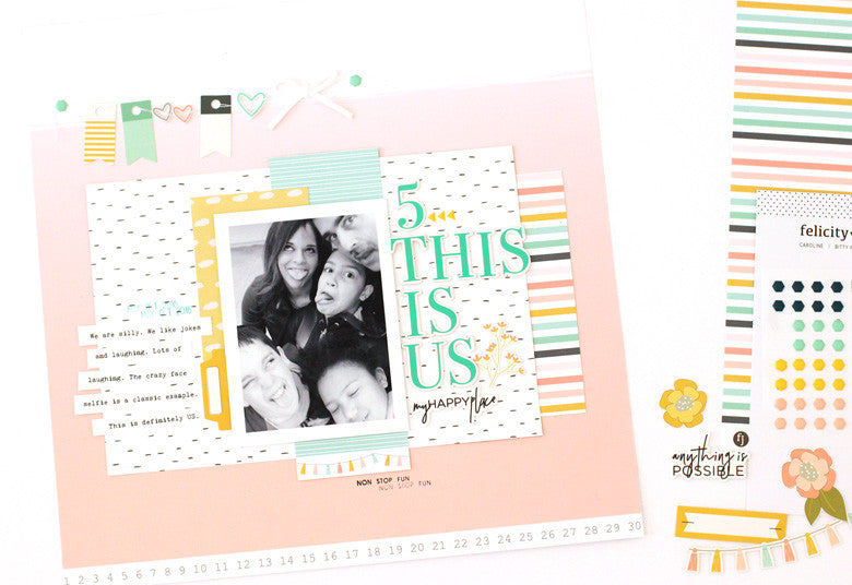
I've been working with some beautiful things lately. First up, let's take a look at the in the new Felicity Jane May Caroline kit today. I love this color scheme. Actually, I've loved just about all of the FJ color schemes. They are soft, pretty and feminine, but not so overly feminine that I can't use them for my everyday layouts (including the boys).

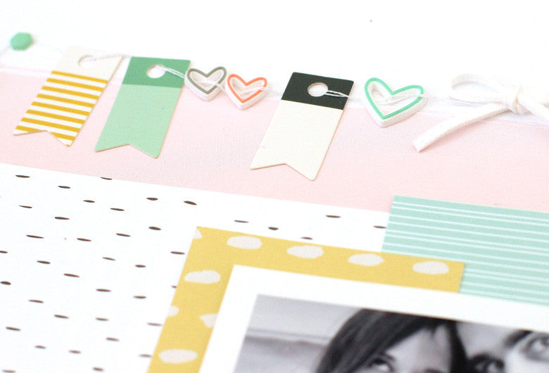
I tried my hand at a banner that was a little 'different'. Banners were a trend that blew up a few years ago. I challenged myself to do take another spin on them.

I try to think of products 'outside of the box' that they were intended! For example, the rubber charm hearts in this month's kit. That opening in the center makes them perfect to string along my banner. The add that unexpected design element that makes layouts pop. To anchor the banner, use two puffy hexagon shapes with a punch of color. And to add a dainty something, you can't go wrong with a suede bow.

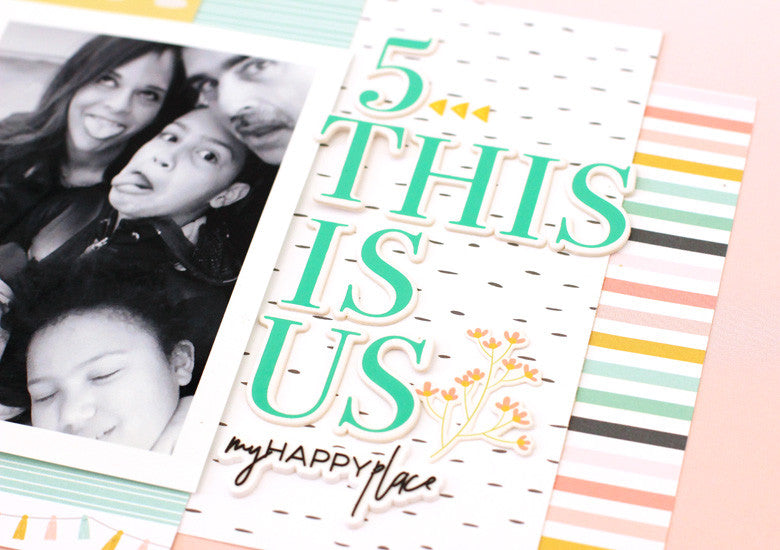
The title is a smash up of my favorite things in the Caroline kit. I started with that bold aqua alpha and worked from there. For contrast, the script silicone charm was perfect. And for pops of color, the yellow flower die cut and puffy arrows were perfect. The stacked title balances out the photo, paper layers and the banner.
Create banners with your favorite bits and pieces to decorate your stories!


Haha)) Such a fun layout!
ReplyDeleteThanks Anya! :)
Deletehello !!!
ReplyDeleteonline baccarat
บาคาร่า
baccarat
Great for security and organization. Wristbands247.com
ReplyDelete