Showing posts with label Design. Show all posts

June 7, 2017

Color Flow + Felicity Jane Summer

When I opened the Summer Kit, the first paper that caught my eye was this beauty. The perfect shades of a summer sunset with a kick. It reminded me so much of the scenery during a trip to Discovery Florida Orlando, that I decided to use it to tell the story of this amazing spot.
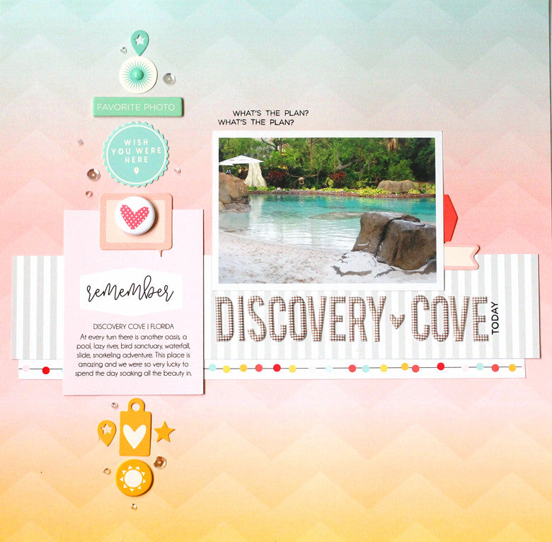
Discovery Cove by @nancydamiano | @felicityjane
This pattern is so beautiful, I had a hard time covering it up! I wanted the design to flow naturally with the colors in the background. I started by gathering chipboard, die cuts and a journaling cards in the same colors of the paper.
Discovery Cove by @nancydamiano | @felicityjane
I lined up the colored embellishments to match the shades in a vertical line. This really emphasizes the transition of color while the embellishments add a variety of shapes and texture to the page. A well-designed paper like this can serve as a guideline while adding your own twist! 
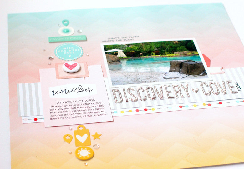
Discovery Cove by @nancydamiano | @felicityjaneWhen creating a transitional, vertical line of embellishments like this remember to use many different shapes and sizes. The more the better the design will flow. Notice that a sprinkle of tiny sequins (from my stash) lead the eye from the top to the bottom - almost like a sparkly bread trail.
Discovery Cove by @nancydamiano | @felicityjane
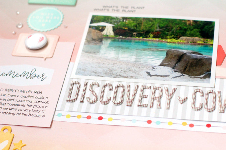
The chipboard title is very long and serves as a shelf for the photo. The words underline the focal point and really draw attention to the center of the page. I placed a strip of neutral, gray striped patterned paper just underneath to ground the words. A border from one of the papers in the kit add a punch of color and some fun circles.
Discovery Cove by @nancydamiano | @felicityjane
Summer colors and photos are my absolute favorite to scrapbook. This beautiful kit is the perfect compliment to all of my summer stories. Don't forget to use color flow when you want to create beautiful layouts with a bold design.

May 3, 2017

Vertical Design Tutorial | Design School

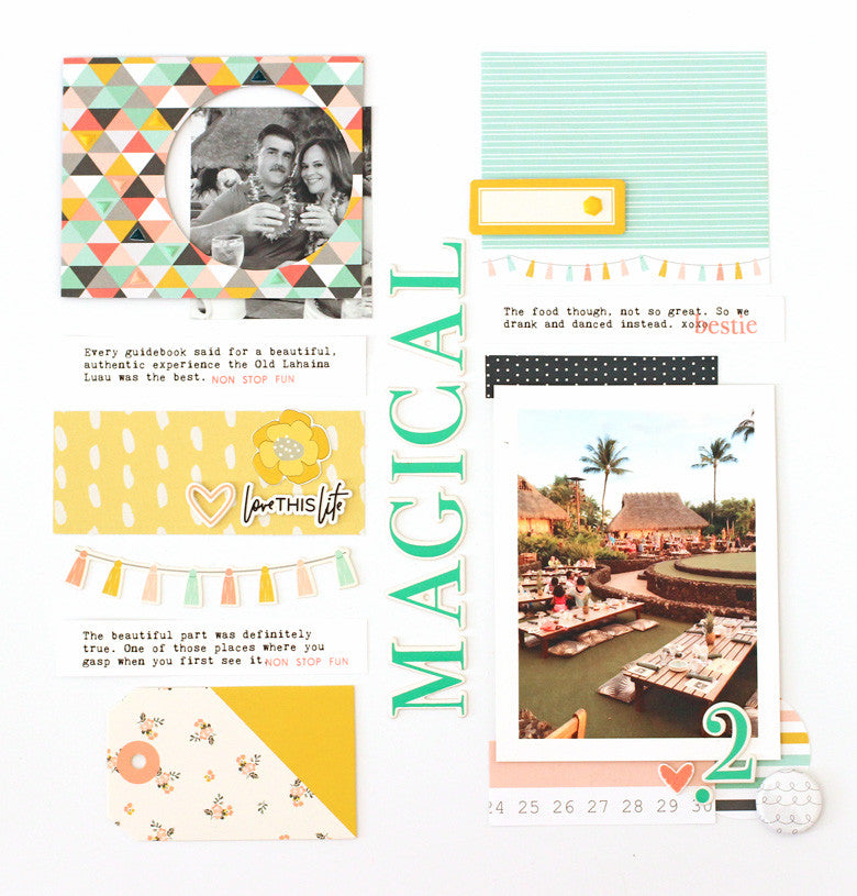
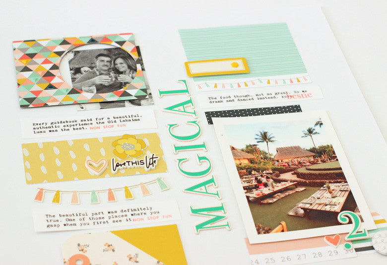
Let's talk about vertical designs - the ones that area clean and angular with lots of space for decorating and telling stories. I chose this type of design because I'm in love with this alphabet from the Caroline kit. The font, the color, the size - it's absolute perfection. What better way to show it off than to bring it center stage!
Magical Luau by @nancydamiano | @felicityjane
 Begin by dividing the page straight down the middle with a bold title. Then start working in vertical lines to the left and right sides of that midpoint. Make sure that your photos and patterns are evenly distributed. You don't want too much weight on one side - it makes for lopsided designs! For example, if you place a photo at the lower right, balance it with another photo on the upper left like above.
Magical Luau by @nancydamiano | @felicityjane
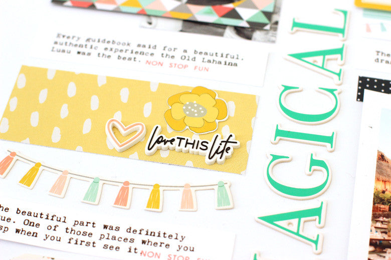
Mix up the widths and shapes of the stacked items in your vertical rows. This keeps the design from looking static (i.e. boring). Here is a rectangular strip of yellow patterned paper with a banner just underneath. This makes for an interesting design.
Magical Luau by @nancydamiano | @felicityjane
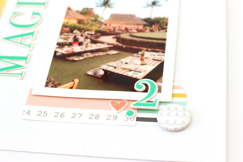
These designs tend to be a bit busy so make sure that you highlight the photo since that's where we want the focus to remain. Using strips of pattern paper to block the top and bottom of this vertical photo, along with layers of flair, circle-shaped patterned paper, chipboard and a heart rubber charm allow this photo to shine.
Magical Luau by @nancydamiano | @felicityjane

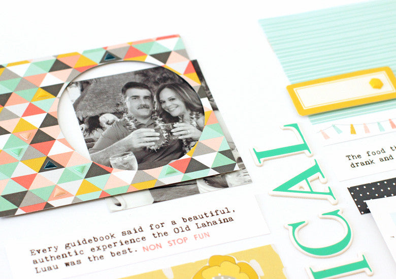
Repetition of shape (and contrasting ones) is really important when creating vertical layouts. Here, the two circles at the bottom right (in the flair and patterned paper shape) and mimicked in this frame. This creates symmetry as well. I love how it highlights this smaller photo as well.
Magical Luau by @nancydamiano | @felicityjane
 Vertical designs are a fun graphic look to experiment with. The Caroline kit with it's beautiful colors and embellishments is the perfect fit for this type of design!

April 8, 2015

Designed 01 | Connections


collection | 
Pebbles We Go Together, American Crafts Alpha, Amy Tangerine Thickers.

story | 
These photos are a series of shots that we took at one of our new favorite places – Smashburger! A French fry was thrown, a kid in a neighboring booth stopped to stare at us and then it just descended into a typical Damiano silly fest. I couldn't stop laughing at the kid's expression. My son (the true product of a scrapbooker Mom) just kept snapping away. So while I started to tell the story of how Smashburger came to town and how much we love it, the photos show who we are. I merged the stories so you get the 'facts' + the personality.


design tips |
  • Photos that are badly lit (like these) are made so much better by converting to black and white.
  • The 2-inch black American Crafts alphabet was perfect for a bold statement - any alpha this size is going to scream for attention.  The placement just under the photos draws the eye as if to say "look here first." Which is exactly what I want!
  • Add random text and shape stamping in a bold color (red here) to a block of journaling text. Notice that adding a tiny bit of red in this area creates a visual triangle (from the red date stamp at the bottom, to the red card, and then the red stamping in the journaling).
  • Black and white photos can often handle the weight of a very bold design. Notice how the pictures are still front and center even though there is so much going on here!
  • It's all about connections. The scripty "the" word and puffy heart connect the cheeseburger/fries card to the title visually. The finishing touches of black paint splatters, enamel dots, date stamp and wood veneer connect the script and blocky parts of the title. Notice that from the wood arrows and flair all the way down to the last of the black splatters create a diagonal line of embellishments - that's not random! Connecting the parts is important for creating designs that work.
I hope you enjoyed my attempt at explaining the whys and hows of what I do. Telling the story through words and photos and design is what I love. So I'm going to stick to what I know and make it a goal to continue this series.  I think that taking the process apart and explaining it will help me grow and push the design envelope (which only has straight lines naturally right?). ;)