It's that time of the year when we travel far (and near) from home to experience all of the best of summer. I was so happy to see a traveler's notebook in this month's kit - perfect for our recent trip to Florida! I decided to focus most of the design in these pages around the stamps included in the Summer Stamp Set. Let's take a look at how stamping + traveler's notebooks are perfect together.

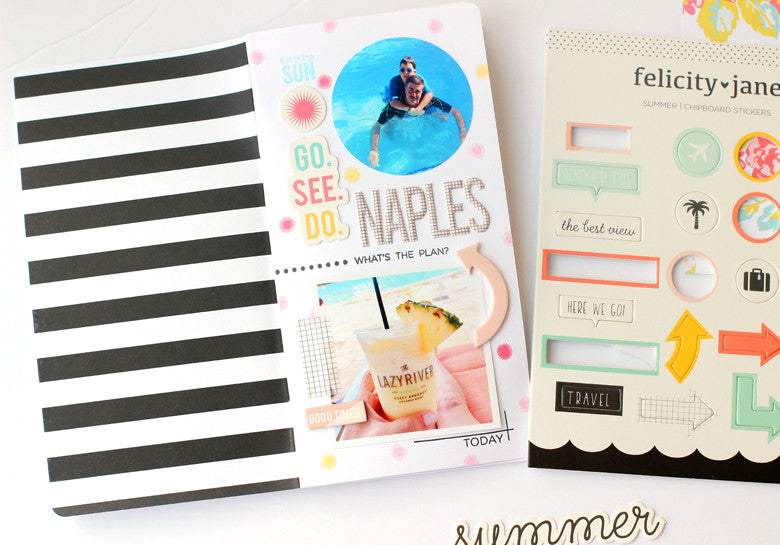
This is the opening page to my notebook. Don't you love that nice, bold black and white stripe on the inside cover? I started this page by using the small starburst in the Summer stamp set to create a fun background. Scattering stamped dots is a great way to add color to your notebook without the bulk of patterned paper.

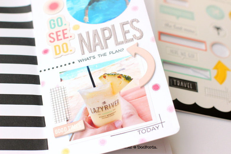
I separated the top and bottom halves of the page by using the dotted line and "what's the plan" stamps. This simple line creates a border between the two photos.
This page contains also cleverly contains the "where" of my trip. If you take a close look at the photo of my drink, you can see the name of the resort. To highlight a main photo like this one, use the corner lines stamp and a sentiment from the Summer Stamp set to frame it out.

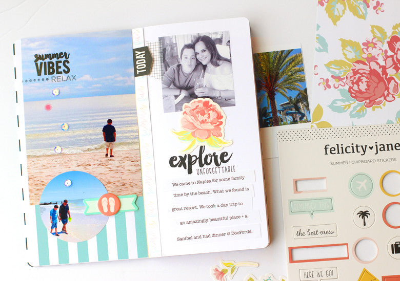
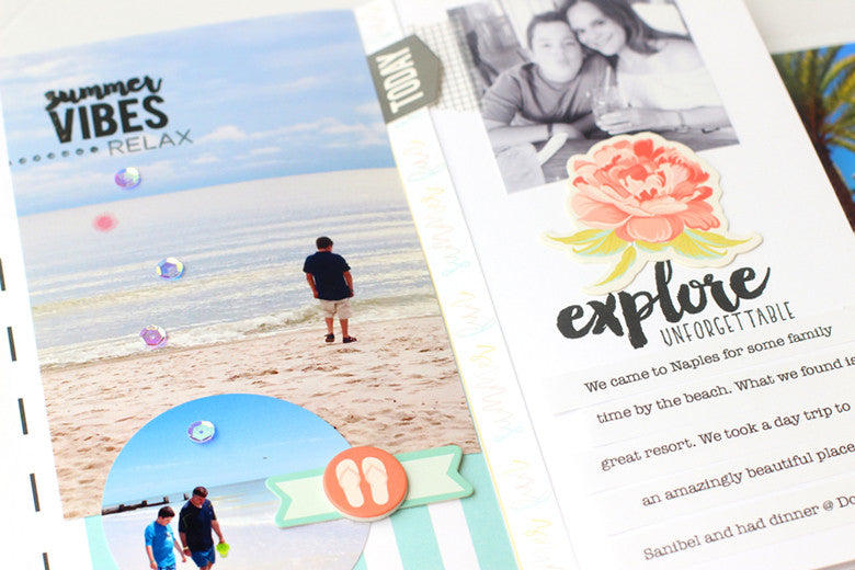
Adding a stamped title right in your photo is a great way to not only highlight the subject, but also cuts down on the bulk of sticker alphabets. Remember to use a permanent ink like Versafine when stamping on photo paper. The same idea was used on the right side with the center, stamped title. The "explore" stamp looks like faux script writing here.

Thanks so much for stopping by today. I hope you've gotten some tips on how to use stamps in your notebooks. Happy travels!


No comments:
Post a Comment